
A first look at Peak Design's new colorways
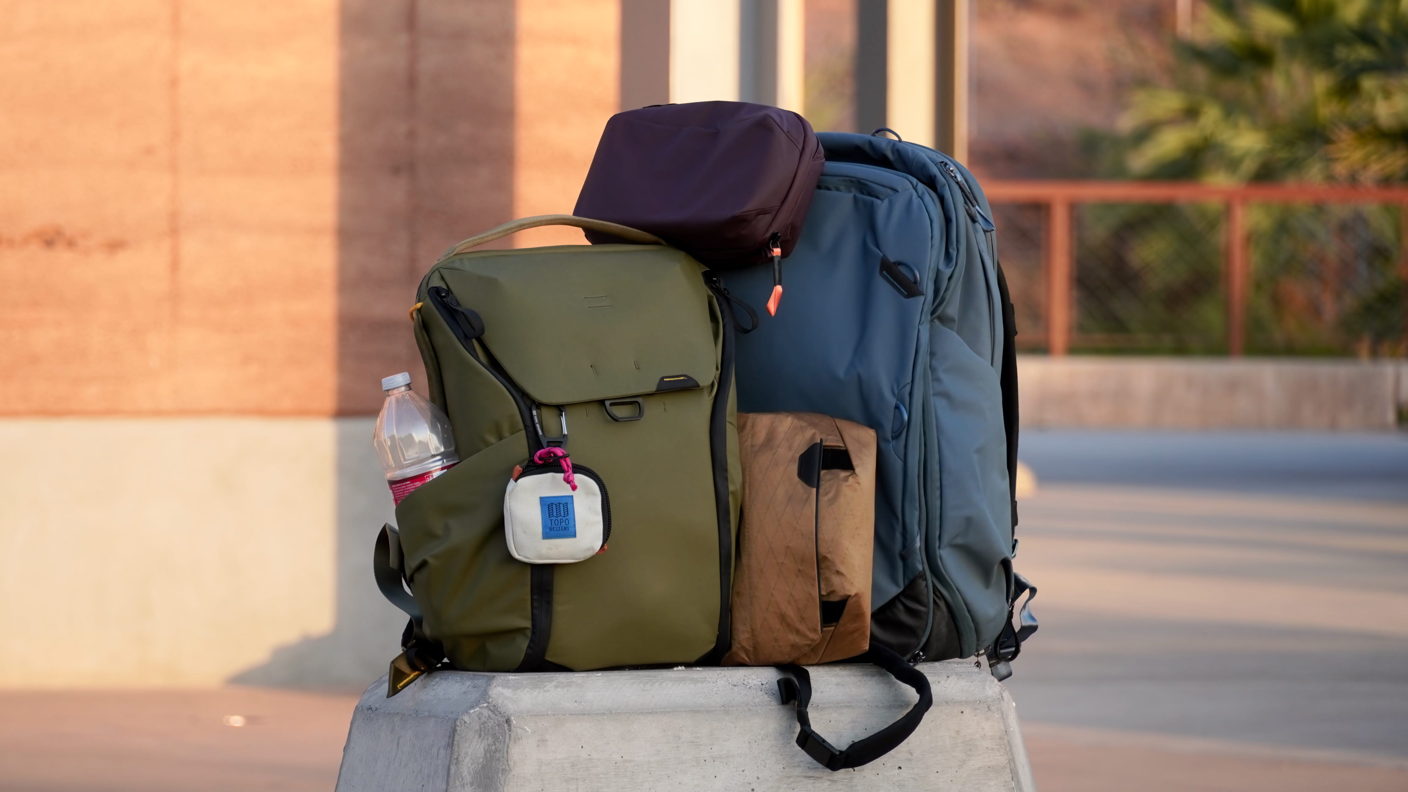
Peak Design is launching five new colorways across its major product lines starting today, Aug. 12, and they’re set to add a major pop of color. Eclipse, Kelp, Ocean, Ibis, and Coyote will be offered in various products in the Everyday Bags, Travel Bags, Packing Tools, Camera Clips, and Camera Straps categories. You can buy them starting now on Peak Design’s website, in Peak Design retail stores, or at third-party retailers.
Some of these colorways are new, like Kelp, Ocean, and Ibis. Others are ones we’ve seen before, like Eclipse and Coyote. And avid Peak Design fans already snuck a peek at some of these color options via social media teasers and livestreams. Either way, it’s a massive color launch that adds much-needed consistency and variety to Peak Design’s lineup.
There’s consistency in the sense that you can now build a matching gear kit of Eclipse products spanning the Outdoor, Everyday, and Travel lines. Before, you could only get Eclipse in phone cases, the Outdoor line, and the Roller Pro. There’s also variety in the sense that Ocean and Ibis are completely-new colorways to choose from.
I’ve been testing these five colorways in the wild for about a week, and I’m a big fan. They don’t look nearly as gaudy in person as they might online, for starters. What makes these new offerings great isn’t their primary colors, it’s their accent colors. Eclipse bags open up to a bright, high-visibility citrus orange on the inside. Kelp gear is lined with bright-yellow external carry loops and black accents throughout.
There aren’t any changes to these Peak Design products aside from color, so it’ll really come down to whether you’re in the market for some new gear and like the new options.
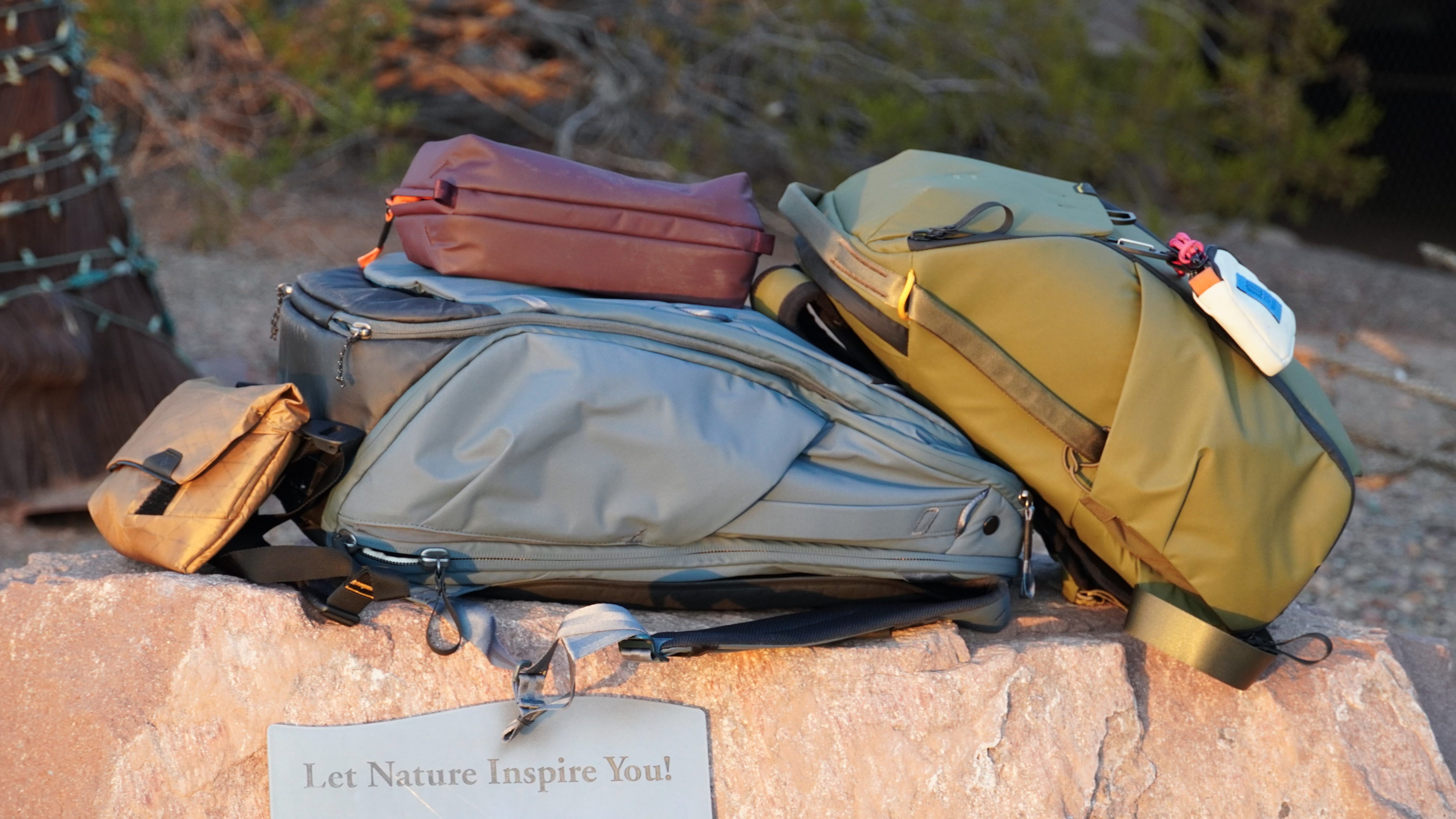
Everyday Backpack 20L in Kelp
Out of all the new color options, Kelp surprised me the most. I’m usually not a fan of green, and Sage — while a fan favorite in the Peak Design community — didn’t interest me. Kelp is a different story, though. It’s a deeper green that can give G.I. Joe vibes in darker lighting but brightens up outdoors in direct sunlight. I personally love how the black bottom, zippers, and straps complement the Kelp portion of the bag.
The yellow zipper pulls and external carry loops are the difference-makers for me. Combined with the other black accents, the Kelp Everyday Backpack 20L becomes more of a statement piece than just another green bag.
Travel Backpack 45L in Ocean
I feel like Peak Design made the Ocean colorway just for me. Obviously, it didn’t, but I definitely asked for it. Here’s what I had to say while reviewing the Coyote X-PAC collection last year:
Now, I’m east coast U.S. born & raised, and I’m not sure how much I’d like Coyote back home. If you ask me, Peak Design should immediately start exploring an Atlantic Blue (or similar color) for the X-PAC Ocean Edition. I’d much prefer a nice blue to Coyote if it was available.
Admittedly, Ocean isn’t made out of X-PAC — it has the same recycled 400D nylon canvas shell as the rest of the lineup. It looks just as good as I imagined regardless. I’ve been using the Ocean colorway of the 45L Travel Backpack, and it’s stunning. Like the Kelp colorway, the black accents on the straps and more create a neat two-tone look.
Field Pouch in Coyote
We’re all pretty familiar with the Coyote X-PAC colorway. It first debuted across the Everyday and Travel lines, and it’s hitting the Field Pouch and Travel Backpack 30L now. The unique reflectivity and durability of X-PAC isn’t for everyone, but I think it’s a particularly fitting colorway for the Field Pouch — great for outdoor hikes and excursions.
Wash Pouch in Eclipse
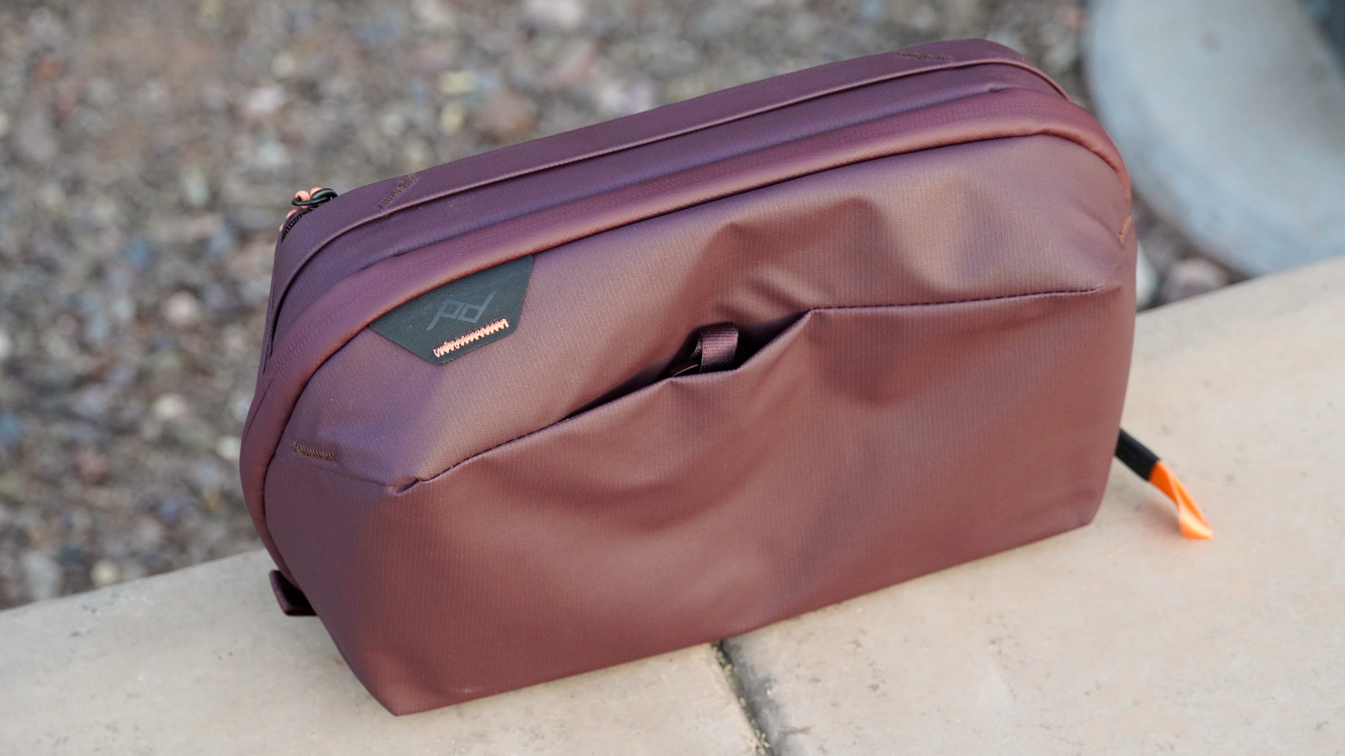
I’ve talked a lot about the accent colors, and how they make these new colorways pop. There’s no better example of that premise than Eclipse. It’s a beautiful, deep purple on the outside that looks great on its own. Then, when you open it up, you’re greeted with a stunning circus orange color that adds an even bigger pop of color and extra visibility.
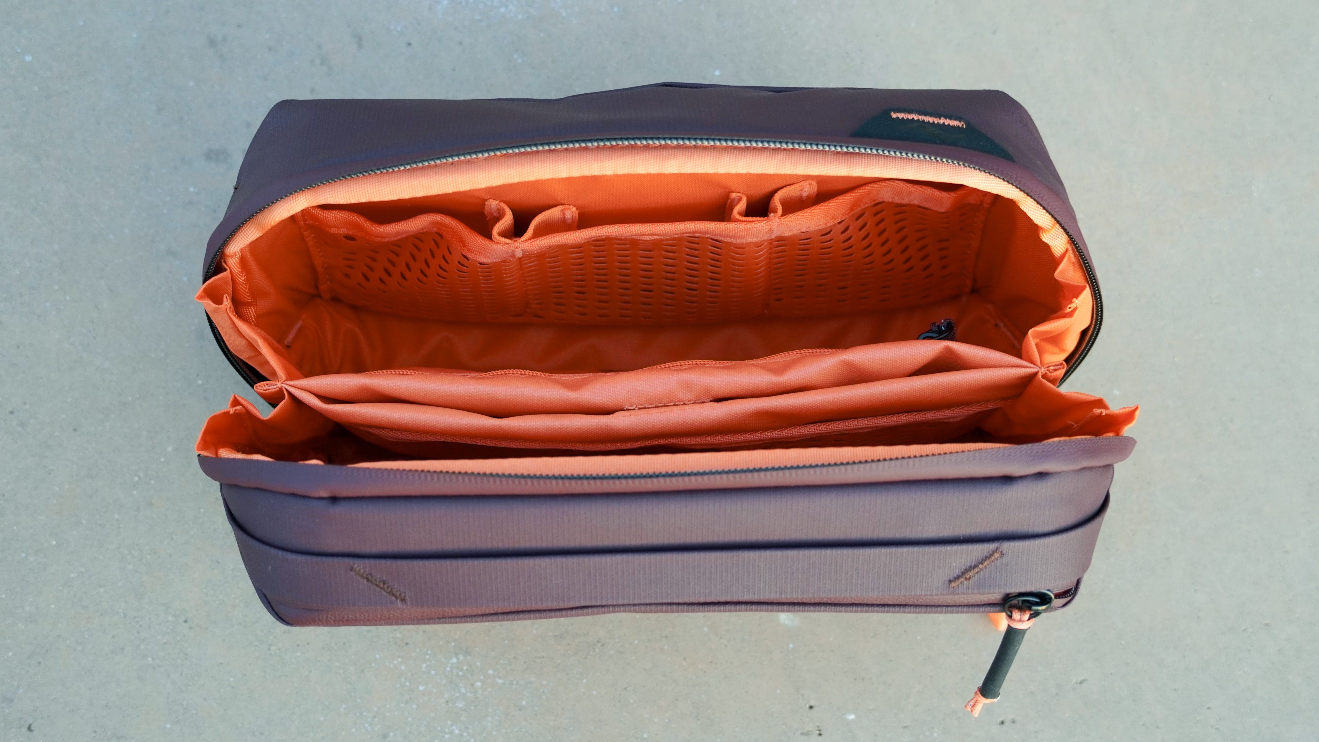
I checked out the Eclipse version of the Wash Pouch, and loved the look. But it might look even better on something like an Everyday or Travel bag, where the entire interior will be lit up with this accent color.
Packing Cube in Ibis
Ibis is a neat colorway that’s bright and colorful, sort of like an orange or grapefruit hue. It’s only available for certain products, like packing cubes and the packable tote, but that’s okay. The high-vis look is perfect for those applications, whereas it might be too intense for a full-on backpack. It looks quite similar to the interior color of Eclipse bags.
What I’m loving about these colors (and what I want to see)
Personally, I found many of Peak Design’s traditional colorways to be a bit too discrete. Black, Ash, Bone and Charcoal never really stood out to me, and even Midnight wasn’t as eye-catching of a blue as I wanted. Of course, some want their camera bag to be low-key, and those existing colors should stick around for that audience. I’m just happy Peak Design is now catering more to the eccentric crowd, too.
As for what’s next, I’m hoping these colorways continue to break into more Peak Design product categories. I’d love to see an Ocean version of the Roller Pro or even a phone case, for example. It’s not always feasible to offer every product in every color, but the goal should be for users to be able to build a complete, matching kit if that’s what they want.
Peak Design Roller Pro hands-on: 5 things I love (and 3 things I don't)

I’m not shy about paying for expensive gear, and that’s why I shelled out a whopping $440 for a carry-on suitcase a few years ago. I bought the Samsara Grand Carry-on for my partner and I, and things haven’t gone so well. On our very first trip, an airline forced us to check one of the Samsara suitcases, and its hard shell cracked. The other suitcase held up a bit longer, but flash forward a few years and its plastic latches are starting to fall apart.
That’s why when Peak Design offered to send me a Roller Pro, the brand’s first attempt at a suitcase, I jumped at the opportunity to test it out. In the past, I’ve reviewed Peak Design’s Outdoor Line, Everyday Line, and Travel Line, and rotate gear from those lineups regularly. For reference, I daily a Sony a6400 mirrorless camera with Peak’s micro clutch attached, and my current EDC bag is the Topo Designs Apex Global Briefcase.
After many teasers, the Roller Pro is launching today on Kickstarter. It’ll retail for $599.99 when it becomes available through Peak Design and partners in June 2025. If you back now, it’ll be available either at a bigger discount if you want to wait beyond widespread availability, or a smaller discount if you want it ASAP. With that being said, I’ve been using the Peak Design Roller Pro for about a month, so let’s review what I like (and what I don’t) about this suitcase.
FYI - Peak Design provided a sample of the Roller Pro for the purposes of this article, but didn’t have any input and didn’t see it before publishing. I don’t use affiliate links, so I won’t earn anything if you decide to back this Kickstarter.
What I like about the Peak Design Roller Pro
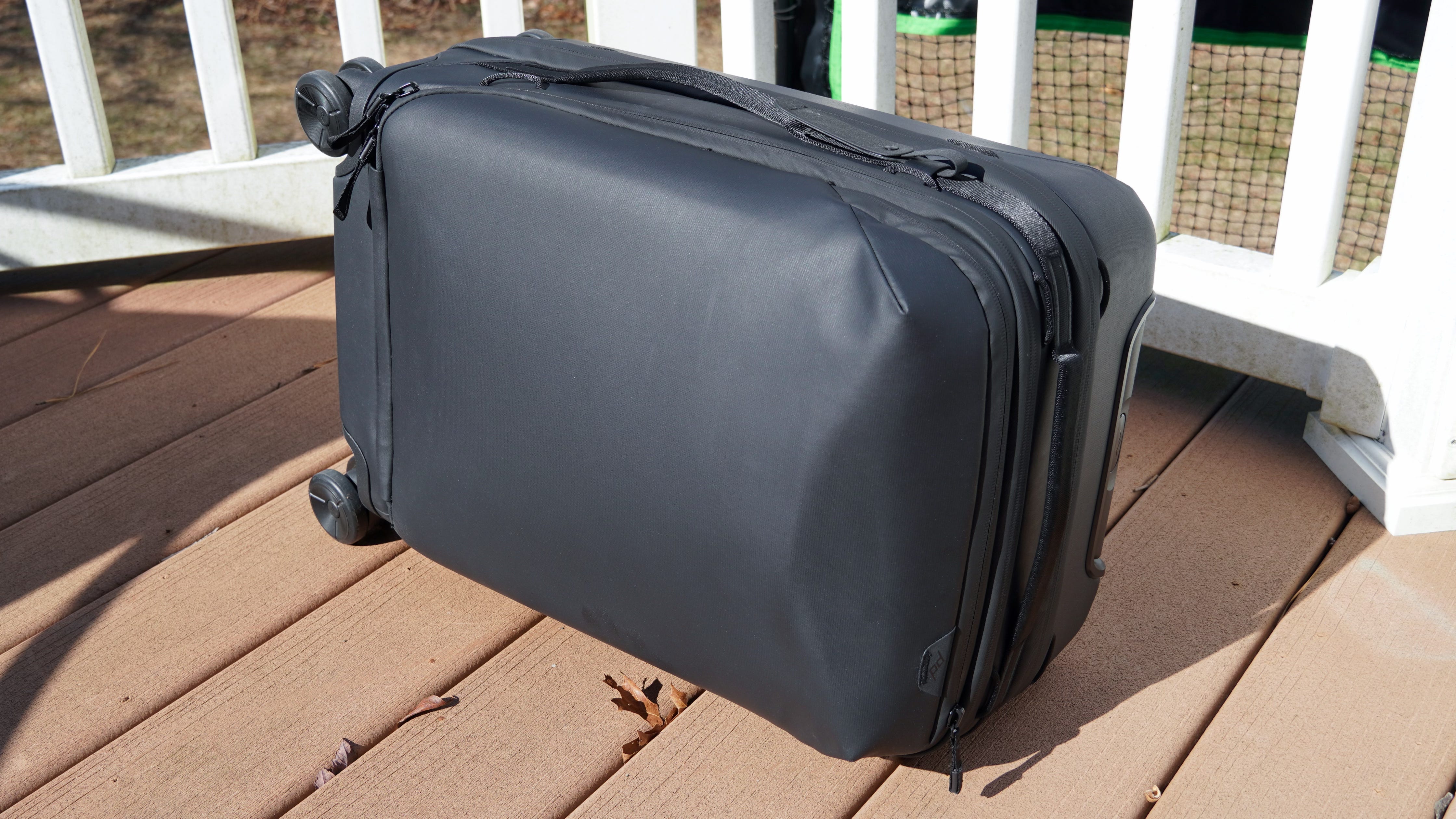
First off, let’s review a few quick facts about the Peak Design Roller Pro. It might look like a backpack, but it’s not. This a carry-on-sized bag that uses a hybrid build that includes a polycarbonate inner shell with VersaShell fabric covering it. Instead of opening like a clamshell, Roller Pro uses what Peak Design calls a “drawbridge” opening system. It unzips from the front, folding outward and secured with cord hooks. You can detach the cord hooks if you’d like to allow the carry-on to open up completely.
Roller Pro isn’t an ultralight carry-on by any means, as those typically weigh between 4-6 pounds. The suitcase measures 21.8 x 14 x 9 in. and weighs 8.8 pounds. The company says it’s approved for international carry-on sizes, but that likely only applies when the bag isn’t expanded. Roller Pro starts at a 34L size but can be expanded to 39L. When I checked United’s size restrictions ahead of my cross-country flight, I learned that the expanded size would certainly be too big. As always, your mileage may vary.
Easy access to a laptop/tablet sleeves and travel essentials
A stick of deodorant, allergy medicine, and TUMS were never far away
While I would consider myself an amateur photographer, I’m a tech guy first and foremost, so I review gear through that lens. That’s why I like that Peak Design thought to include a laptop or tablet sleeve on Roller Pro. The top-front of the bag includes a small pocket with room for a laptop, tablet, or magazines — or a combination of those types of items. The top of the pocket has a pouch similar to those you’d find on a Peak Design backpack, and there’s a divider for keeping things organized.
It’s hard to understate how essential this pocket is. I keep a stick of deodorant, a bottle of Zyrtec allergy medicine, some TUMS, or really whatever else I need quick access to inside it. If I was traveling on a long-haul route, I might keep a toothbrush or other toiletries there. My last suitcase was a hard-shell, and this kind of thing wasn’t possible.
Then, there’s the laptop compartment. It’s deep, with enough padding and rigidity for me to feel confident putting valuables in there. As someone who carries with multiple tablets and laptops for every trip, this is a must-have feature. It also makes one-bag travel possible with just Roller Pro.
The SlimDrive handle and ‘drawbridge’ opening system really work
I can pack this roller full of gear and stuff without laying on it to shut it
Peak Design touts two things about Roller Pro that make it different from the competition: the SlimDrive handle and the “drawbridge” opening system. The company explains in a press release that the SlimDrive is “a patented, low-profile carbon fiber handle, engineered for maximal strength in a minimal volume.” Essentially, it’s supposed to give you more interior space without sacrificing durability.
I’d say the SlimDrive is as good as advertised, at least in this regard. There are some potential drawbacks I’ve discovered that we’ll review later. For now, Peak Design’s claims that the SlimDrive takes up a third of the space of a traditional telescopic handle seems accurate. I was able to cram more into the Roller Pro than my last carry-on, despite the Samsara Grand Carry-on I was replacing’s claimed 43.5 liter internal capacity. Plus — I didn’t have to jump on top of the Roller Pro to zip it up.
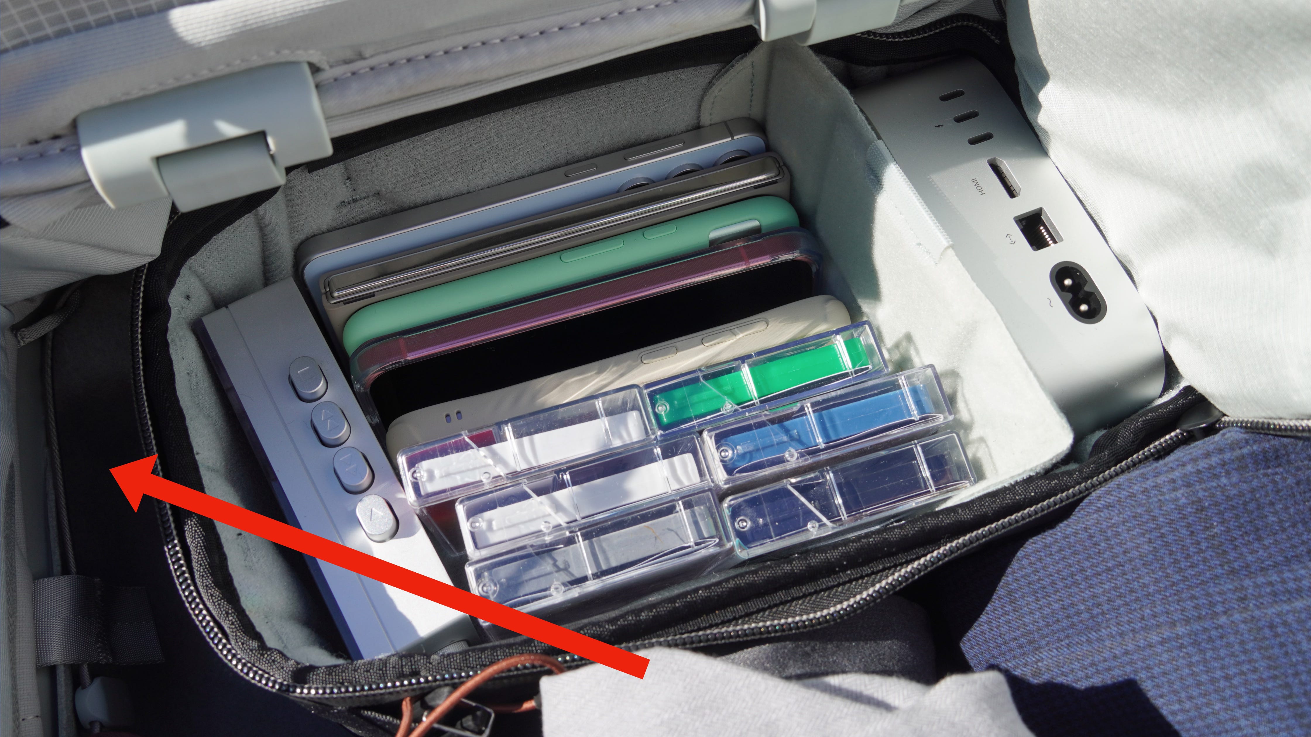
Here’s a quick list of all I fit inside the Roller Pro:
Front pocket: Deodorant stick, Zyrtec, medicine ziplock bag
Laptop sleeve: Tablet, keyboard, trackpad
Organization panel: AirTag
Packing gear: Small camera cube, ultralight packing cube with Nike running shoes inside
Clothes: 4 pairs of pants, 2 thick hoodies, 5 t-shirts, 1 pair of running shorts, 2 athletic shirts, 1 polo shirt, small ultralight packing cube stuffed with underwear and socks
I like the drawbridge system because it makes it easier to open and maneuver Roller Pro in tight spaces. It’s easy to make it your own with the cord hooks. As I learned with my time testing the Outdoor Backpack 25L, the cord hooks can be somewhat daunting if you’re a first-timer, but after that you get the hang of things quick.
It has just the right amount of interior pockets
You can use them, but won’t lose space if you don’t
I enjoy organization as much as the next guy, but pockets are usually bad. They take up space and if you don’t have something that perfectly fits inside them, pockets are more of a nuisance than anything else. The good news is that Roller Pro’s pockets are nearly flat and don’t take up much space. The main compartment is free of pockets — they’re all on the “interior organization panel,” a.k.a. the front part of the suitcase that opens up like a drawbridge.
You get three wide pockets that are all the same size. They’re not advertised as being water-resistant, but they appear to be ideal for toiletry organization, or wet clothes. Those three smaller pockets are part of one big pocket, which can be stuffed with whatever you want — dirty clothes seem like a safe bet. There’s no “good” place for a garment bag in Roller Pro, but this larger pocket is your best option.
Inside that big pocket is a hidden AirTag pocket that’s thankfully actually hard to access, and a Passport pocket you probably won’t ever use. It could come in handy if you’re flying domestic and want a backup for your driver’s license or government ID that’s stored in a separate place.
But as I mentioned, the best feature about Roller Pro’s pockets are that there aren’t any in the main compartment. Peak Design could’ve packed the main compartment full of pockets, but instead relies on the cord hook and packing/camera cube systems for organization.
Speaking of things Peak Design could’ve included on the Roller Pro, but didn’t: TSA locks. The way Peak explained this omission to the press is simple. TSA locks are a controversial feature — some people like them, others don’t. The company didn’t want to put something on Roller Pro that only half of people use, so TSA locks aren’t standard on the carry-on bag. You can still get a third-party lock and use it to secure both ends of each zipper together to keep the bag closed.
This was absolutely the right choice, because TSA locks are pointless. They can be unlocked with a master set of keys that any would-be thief can easily buy online. Or, if I really want to steal your stuff without buying a master set, I can just cut the lock or the bag itself. I, for one, am glad there isn’t a bulky TSA lock built into the Peak Design Roller Pro.
The modular Camera and Packing Cube storage is ingenious
You can create any ratio of tech and clothes storage, and it’s TSA-proof
The wide-open main compartment, which relies on the packing and camera cubes, isn’t perfect. We’ll get to that later. But it’s pretty damn good, and lets users configure whatever ratio of tech/camera gear they’d like. Peak Design is debuting the XL Camera Cube alongside Roller Pro, which perfectly fits inside the suitcase, filling all of the interior space. Speaking with professional photographers and videographers over the years, there will certainly be an audience for a feature like this.
I don’t own or need that much camera gear, so the XL Camera Cube isn’t really for me. Instead, I went for a Small Camera Cube and two Ultralight Packing Cubes. The rest of the space got filled up by clothes. It worked out great, because I was able to fit more tech and gadgets inside my carry-on than usual. I crammed an M4 Mac mini (yes, I travel with one now), about 7 smartphones (sorry, the Nothing Phone 3a series just launched), and a Fiio cassette player with a bunch of tapes (no excuse for this one, other than I love music) inside the Small Camera Cube.
Something the company mentioned that really resonated with me as a consumer is that the camera cube system makes it easy to take out all your tech or camera gear at once, if you need to. This could be during a TSA check or if you are required to gate check your carry-on. It’s not an exaggeration to say that I’m terrified of either of those outcomes when I mix in tech or camera items with my clothes. The combination of a few Roller Pro aspects — drawbridge opening system for tight spaces, easy-access laptop pocket, camera cube support — have all but eliminated my worries.
No, you don’t need Roller Pro. But if you’re like me and carry thousands of dollars worth of gear (pls don’t rob me) for just a weekend trip, Roller Pro might give you enough piece of mind to make you want it.
If you break it, Peak will (probably) fix it
Roller Pro is backed by the same lifetime warranty Peak Design regularly honors

Perhaps the best Roller Pro feature is that it’s backed by Peak Design’s lifetime warranty. If you ask me, this makes any controversy about the pricing irrelevant. $600 for a bag that’ll last my whole life? Sign me up. Considering I’ve lost a suitcase or two to damage while traveling and I’m only 22 years old, this is music to my ears.
Some aspects of Roller Pro are designed to be easily replaceable, like the 60mm wheels. Others aren’t, like the SlimDrive handle. Either way, if your bag breaks, Peak Design will probably fix it.
I only say probably because warranties are only ever as good as a company a) continues to exist and b) wants to honor them, so they’re not a certainty. However, I see examples of Peak Design customers getting taken care of with warranty claims all the time on social media, and I’m confident recommending the company’s warranty as a key selling point.
What I don’t like about the Peak Design Roller Pro
I took the Peak Design Roller Pro on a cross country trip from Phoenix to Newark that involved multiple car rides, airtrain journeys, commuter rail trips, and five hours in the air — plus everything in between. I’m pretty rough with my gear, and try to get from point A to point B by traveling as quick as possible (must be the cross country runner in me). So, if there’s a weak point in Roller Pro, I’ll probably find it.
There’s too much ‘roll’ in the Roller Pro
It starts rolling away every time I let go of it

One of the great things about Roller Pro is both the wheels and the SlimDrive handle have a satisfying glide to them. However, the wheels have a bit too much glide. I can’t get the Roller Pro to stay still on a hard surface, no matter how flat it is. Basically any time I let go of the bag at the airport, whether it was to unload my pockets at TSA or to order a Jersey Mike’s sub, it rolled away. Although this was a really annoying part of using the bag, it’s not quite enough to get me to stop using it.
Camera Cubes could fit better in the main compartment
Securing them like you would in a Travel or Outdoor bag will waste space
Peak Design bags that use camera cubes and packing cubes for organization usually utilize clips or cord hooks to secure things inside the bag. Naturally, I tried to configure the Peak Design Roller Pro the same way, using the clips that came inside the camera cubes. I hooked the clips onto my camera cube, and then to the loops inside the Roller Pro.
While the cubes stayed secure inside Roller Pro, I noticed that not every cube is going to be the same shape as the interior of the main compartment — leading to wasted space. As a result, I opted to leave my cubes unsecured in the Roller Pro as to not waste any space, shoving clothes in the nooks and crannies. It would’ve been nice to see a better system for securing the non-XL cubes.
I’m not sure the SlimDrive handle will hold up over time
It already scratched after one trip in the air
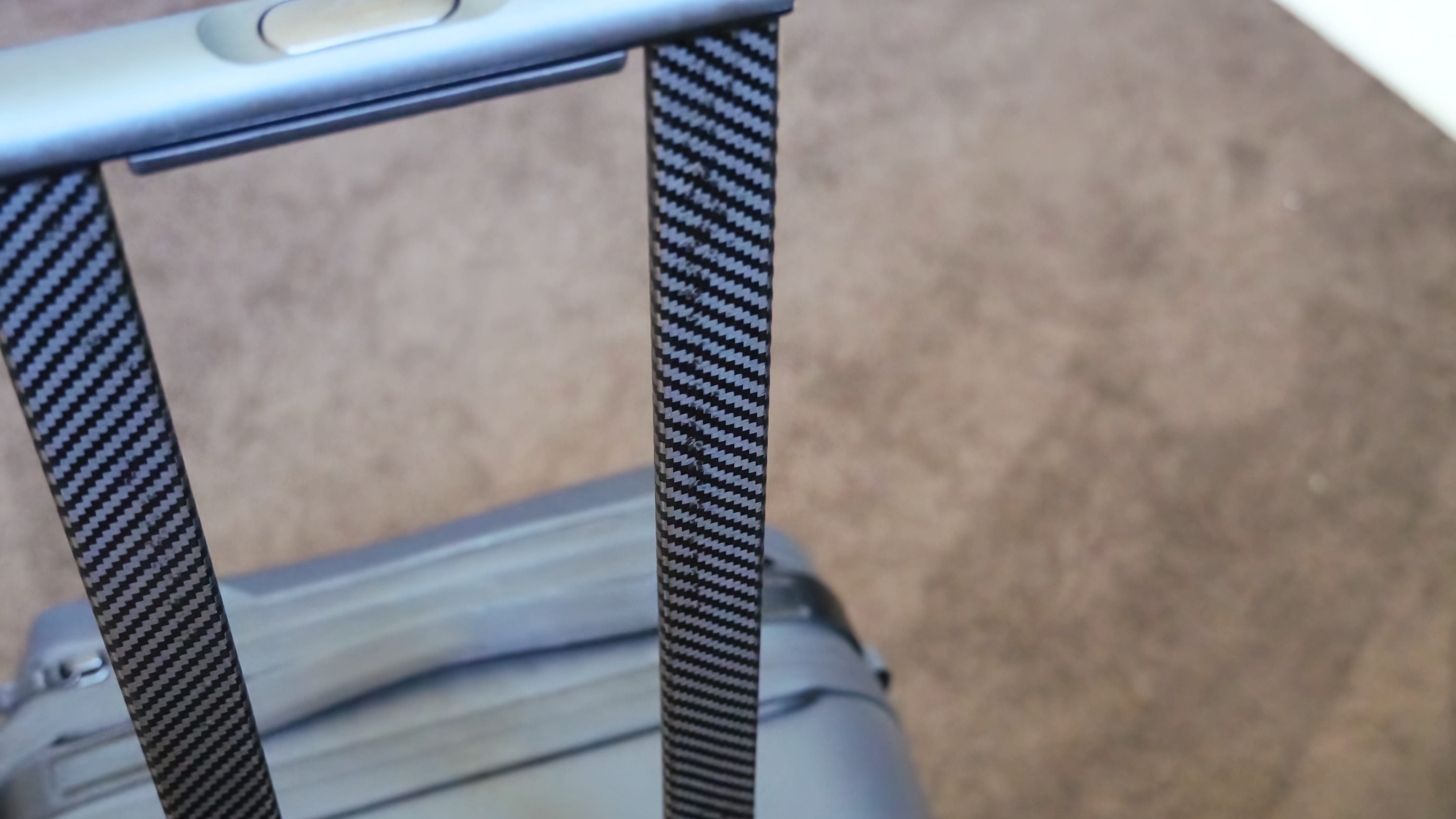
Things rarely break within my relatively short testing period, but usually there’s a part or two that I start to worry about. With the Peak Design Roller Pro, it’s the SlimDrive. The thinness of the handle is slightly concerning, because I quickly learned that I have a tendency to beat up the handles on my suitcases. While riding on the subway or train, I’ll usually lean against my suitcase and handle, pushing it against a seat, pole, or wall for stability. This is something I’ve never noticed, because other suitcases didn’t make me think about it. However, the amount of flex I noticed in the SlimDrive handle when leaning up against it has me a tiny bit spooked about its longevity.
I also picked up on some scratching on the carbon fiber surface of the SlimDrive handle. I can’t say for sure how this happened, but my theory is that it could’ve occurred when raising or collapsing the handle off-angle. Either way, it is visibly scuffed. It’s worth noting that this is a pre-production sample, and it’s possible some of these kinks are worked out before Roller Pro enters mass productions.
Really, I couldn't care less about the appearance of the carbon fiber finish — this bag is a tool and my main priority is that it doesn’t break. I do have concerns about the SlimDrive handle, but if things do go wrong, you do have that lifetime warranty.
Would I buy the Peak Design Roller Pro?
There were certainly pros and cons to using the Peak Design Roller Pro as my carry-on suitcase, but the short answer is that I’d pay full MSRP for this thing. The tech-focused design and lifetime warranty were enough to sell me, and I’m even going to recommend Roller Pro to some of my non-tech friends and family. I’ve tried many suitcases, some nearly as expensive as this one, and too many that claim to be “smart” or “tech” luggage and drop the ball.
This bag won’t be for everyone, but it does deliver on nearly all the promises it makes.
Vinyl Vision for Apple Vision Pro is a weird mix of analog and digital
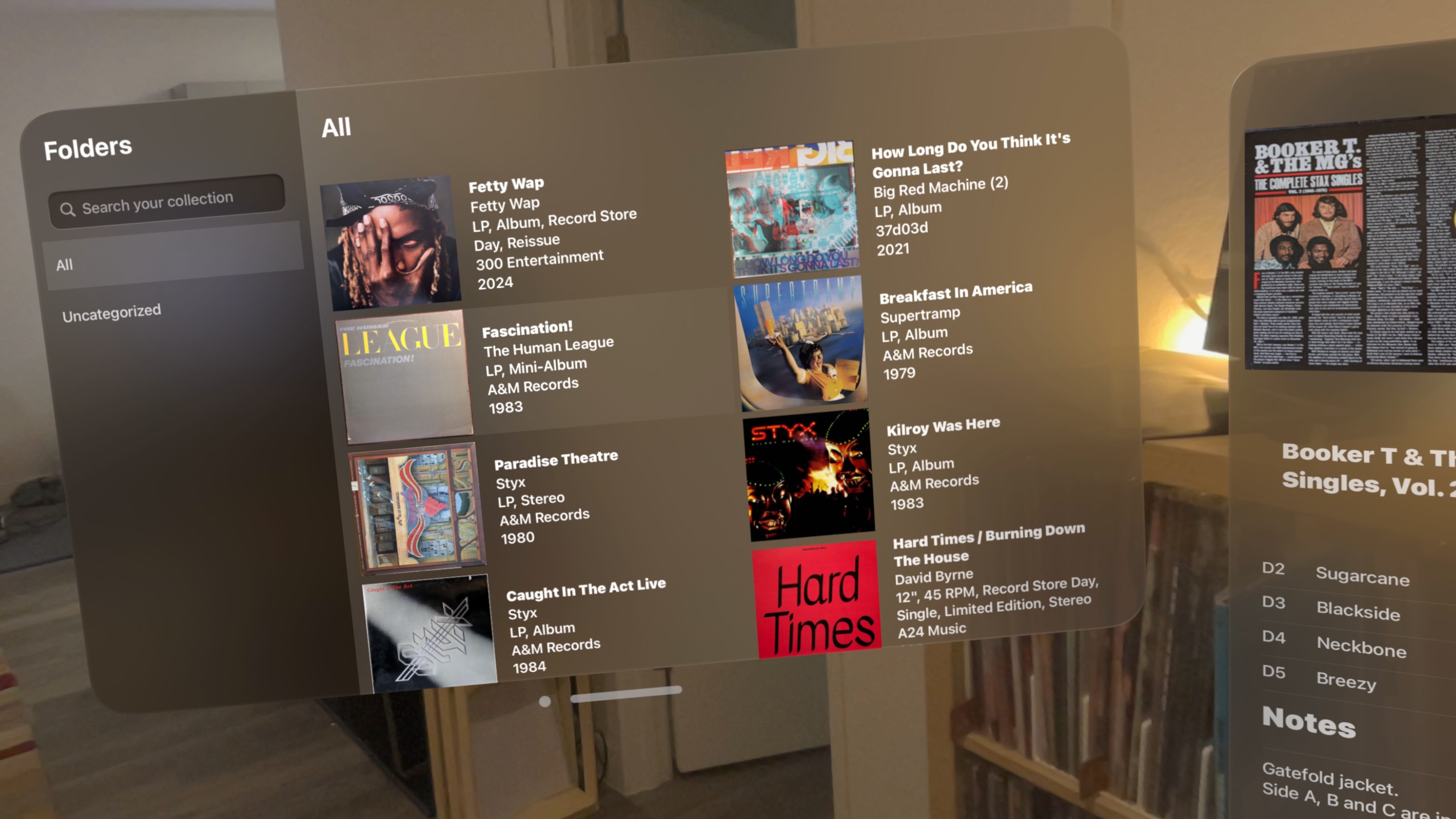
I’ve spent the last few weeks revamping my vinyl collection at home. I bought a new Ikea Kallax shelving unit for storage, wired up multi-room RCA audio, and updated my Discogs collection. That was the end of it, until I stumbled upon the Vinyl Vision app on the App Store. Essentially, it’s a clean visionOS app that lets you interact with your Discogs library, and it’s the perfect paradox of how the lines between analog and digital could be blurred if mixed-realty devices like Apple Vision Pro take off.
For those not as ingrained in 21st century vinyl culture, Discogs is an online database, catalog, and marketplace for vinyl pressings. There are a surprising amount of different pressings and versions of a particular album available on vinyl, and Discogs helps you keep track of them all. It’s an inventory system, appraiser, storefront, tracklist finder, and a whole lot more. But the website is quite utilitarian, and it’d be tricky to navigate it using the eyes-and-hands control of Vision Pro.
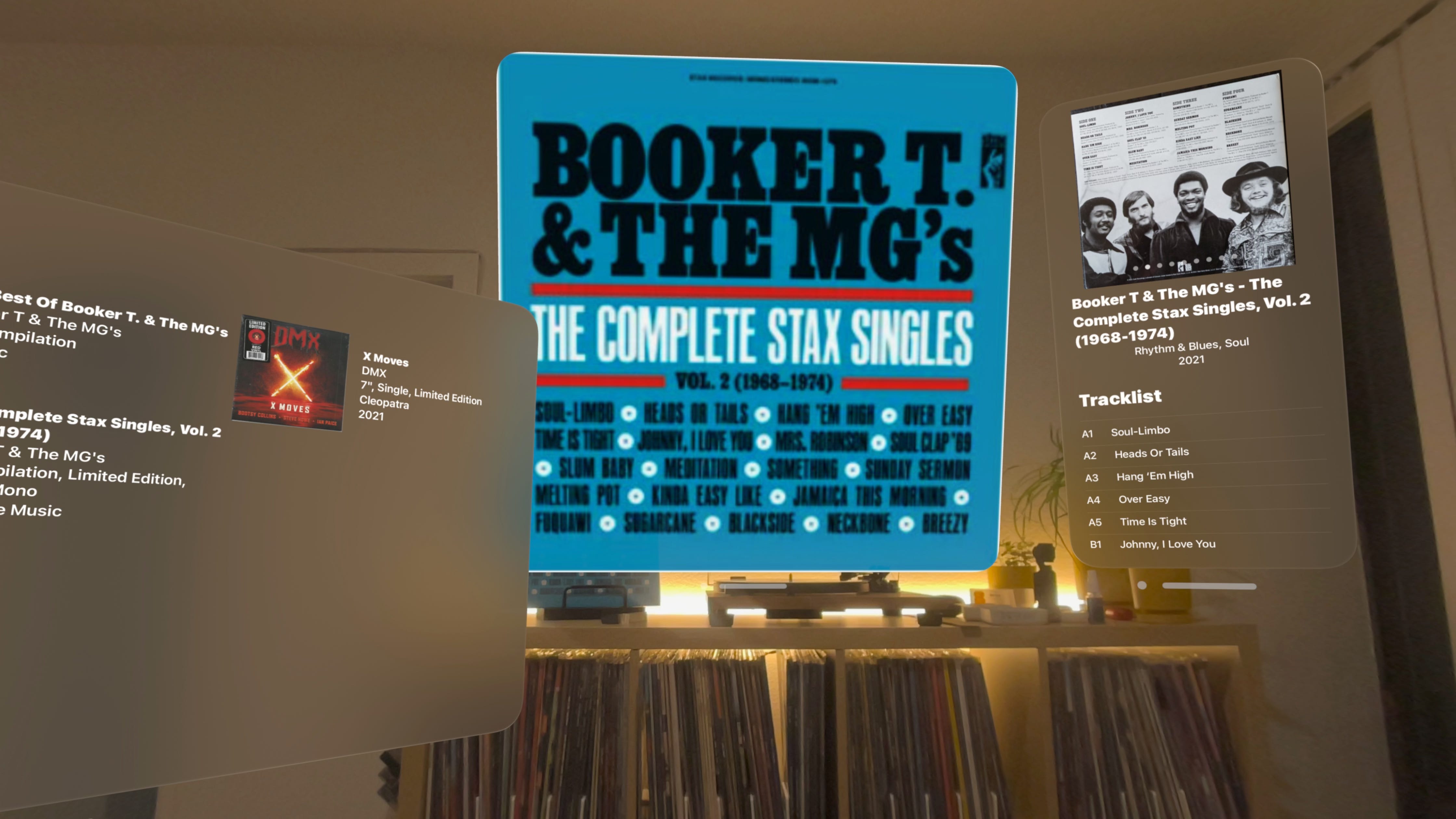
That’s where Vinyl Vision comes into play. It’s a $5 purchase on the App Store that visionOS-ifies Discogs. With floating windows and easy gesture navigation, the app’s developer explains that it’s supposed to turn your database into “a virtual showcase,” per its description. So, I bought the app and gave it a try, like any vinyl-lover with a Vision Pro would.

The app, which integrates with the Discogs API, is fairly limited. It preserves your collection’s organization and folders, and includes the album information, tracklist, album art, and notes for each pressing.
However, it’s just a viewer. There’s no way to add a record to your Discogs collection from Vinyl Vision, which is a disappointment. That limitation means Vinyl Vision can’t completely replace my smartphones or MacBook for Discogs management, and the app just might’ve if adding pressings was possible.
It’s weird to enjoy such a physical and intentional hobby through the lens of grainy passthrough video.
I also can’t help but wonder what it would be like if Vinyl Vision could access Vision Pro’s cameras — it would theoretically be able to scan a barcode of a record in your hand and add it to your Discogs collection with virtually no manual hassle required — but Apple doesn’t allow third-party visionOS devs to access the cameras, so it’s just a pipe dream for now.
I’m also torn on whether this strangle combination of analog music listening and digital music cataloging is fantastic or outrageous. On one hand, you do feel more immersed in your database, as you can throw a picture of your now-playing record on your wall or browse your collection on a screen larger than your TV. It also gets a phone or laptop out of your hands, which frees them up for flipping records and moving the needle.
But on the flip side, it’s weird to enjoy such a physical and intentional hobby through the lens of grainy passthrough video, and with a heavy VR headset strapped to your face. These two experiences shouldn’t blend together, although they seem to better than you might expect. As any Vision Pro user probably knows, the Light Seal has a tendency to break immersion, but Vinyl Vision is a lot more practical with it removed.
For now, I’ll probably stick toward listening to records without Vinyl Vision, at least most of the time. If I do find myself ever stuck not knowing what to play or needing to change things up, I’ll absolutely use Vision Pro to peruse my collection. And in the future, I could really see use cases like this take off when the form factor of devices like Vision Pro become smaller, lighter, and less obtrusive.
Driverless cars are here and ready — but not from the company you expect

I hate ridesharing. It’s expensive, there are “service fees” somehow separate from the cost of the ride, and I’m also expected to tip my driver because billion-dollar companies won’t pay fair wages. They’re never as quick as they say they’ll be, and I’m not much for small talk. That’s why when I spent a week in Tempe, Arizona earlier this month, I moved to enjoy my time in the sun without hailing a Lyft or Uber. As people who have tried living without a car can attest to, it’s harder said than done. That’s true even for a public transit fanatic such as myself.
So, I started my week in Tempe the same as roughly nine million people in the greater Phoenix area — by riding the Valley Metro public transit system. But eventually, you’re bound to run into a situation where public transit just can’t cut it. For me, that was when I just missed a bus running every half hour, and was trying to get to a mall five minutes away. In the 112-degree heat, I was ready to bail on public transit and cut my losses.
Then I remembered: I’m in the greater Phoenix area. It’s one of four regions in the U.S. supported by Waymo, an autonomous driving company that operates driverless taxis under the Alphabet (Google) umbrella. Phoenix — along with San Francisco, Los Angeles, and Austin — is crawling with autonomous Waymo vehicles that claim to be a safer and cheaper way to get around. Believe it or not, as of May 2023, the Phoenix region became the largest fully-autonomous service area in the world, covering 180 square miles.
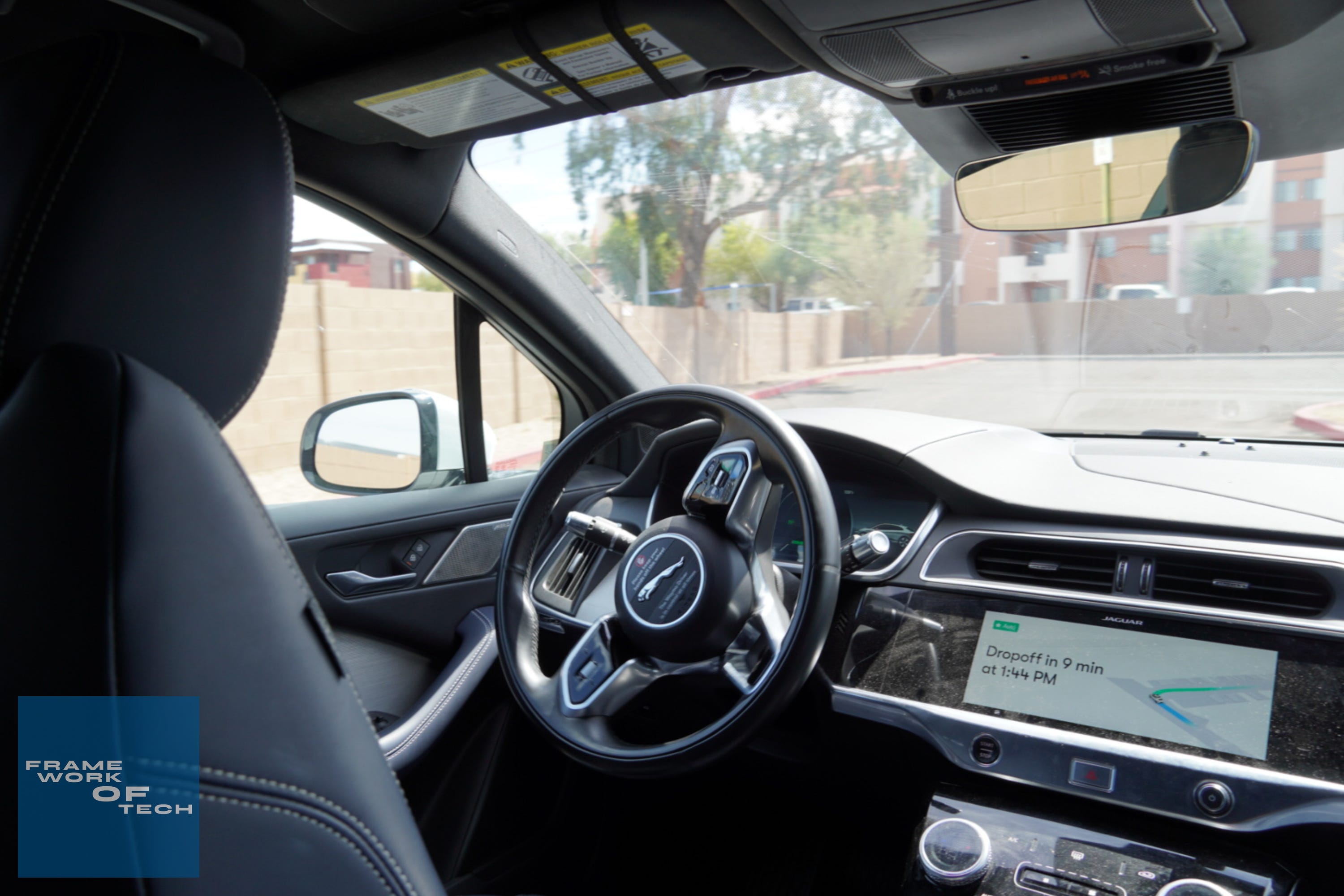
At that point, I did what any curious technology enthusiast and journalist would do. I downloaded the Waymo One app on my iPhone 14 Pro, and priced out a ride to the mall. It turns out that taking a Waymo car would get me there in a quarter of the time public transit would take, only costing around $9.
Only a bit more than public transit, and giving me a glimpse of the future? I was all-in.

After riding with Waymo a handful of times, I’ve discovered that this initial experience represented the best-case scenario. You’ll often find that demand-based pricing makes short rides cost as much as $30 during the busiest times. I can live with that, as it’s the same deal with Uber and Lyft. However, the bigger issues are wait times, which can stretch to as long as a half an hour in times of peak demand. During these times, I don’t consider Waymo a great option and instead look to public transit options.
What it’s like to drive an autonomous vehicle
And more importantly, one with no failsafe
When the Waymo arrived at the pickup point, the process was fairly straightforward. But first, let’s talk about pickup and dropout points. Waymo is very picky about where it can pick you up and drop you off, presumably because it’s looking for a known safe location. In real world use, this likely means you will need to walk to the Waymo for pickup or walk to your destination after you’re dropped off. For me, this is a significant drawback to using Waymo.
If I have to walk anyway, and wait for a pickup anyway, I might as well take the $2 bus instead of the $20 Waymo.
As your car arrives, you’ll see a rotating display on the top of the Waymo with your initials to let you know it’s your vehicle. Then, with Bluetooth enabled, you can unlock the car in the app when you’re within close proximity of it. After that, all that’s left to do is hop in, buckle up, and start riding. The interior of the car is fitted with a slew of cameras and microphones, and the former is running all the time. However, Waymo says that the mics are only hot when you’re connected with rider support.

Once the car gets going, all you’ll need to do is sit back and relax. It’s natural to be worried about the Waymo Driver not being able to handle certain situations, and I was too. However, as others have said about these driverless taxis, Waymo will always be less aggressive than more aggressive. That means you’ll experience things like waiting for a few minutes at a stop sign or an outlet, but you won’t experience your car pulling out when it is unsafe to do so.
So what were my thoughts on using a self-driving taxi? For the most part, I was and still am extremely confident in the Waymo Driver’s ability to get me to and from my destinations safely. There are some things that still make me a bit nervous, like U-turns and high-speed lane changes. Based on my few hours of riding in a Waymo car, I have no reason to believe that Waymo will misjudge a traffic signal or stop sign, ignore a pedestrian, or miss a nearby vehicle.
That anecdotal evidence is backed by some facts, too: The Verge reported that Waymo has driven over a million miles autonomously and was only involved in two crashes that required federal reporting.
Are they ready for widespread use?

I agree with the statement that autonomous vehicles will be much more trustworthy when most vehicles on the road are self-driving. Human drivers are unpredictable, and I’m not sure that self-driving cars will always be able to anticipate human aggression, and human mistakes, quickly enough to avoid accidents. With that said, I still think autonomous vehicles are ready — at least from Google. Compared to Tesla’s self-driving features, Waymo seems to be on a different planet.
I'm excited for the future of autonomous vehicles, and hope that driverless taxis become affordable enough that we can ditch car ownership for good.
Apple FineWoven first impressions: A cool material likely unfit to replace leather

Apple announced the iPhone 15 series last week, and with it, discontinued leather cases and accessories as part of its environmental initiatives. Leather served as the more premium option in Apple’s accessory lineup, with silicone options serving as a slightly cheaper and much more colorful alternative. Apple is ushering in FineWoven, a new microtwill material, as its new premium accessory option ahead of the iPhone 15 lineup’s debut on Sept. 22.
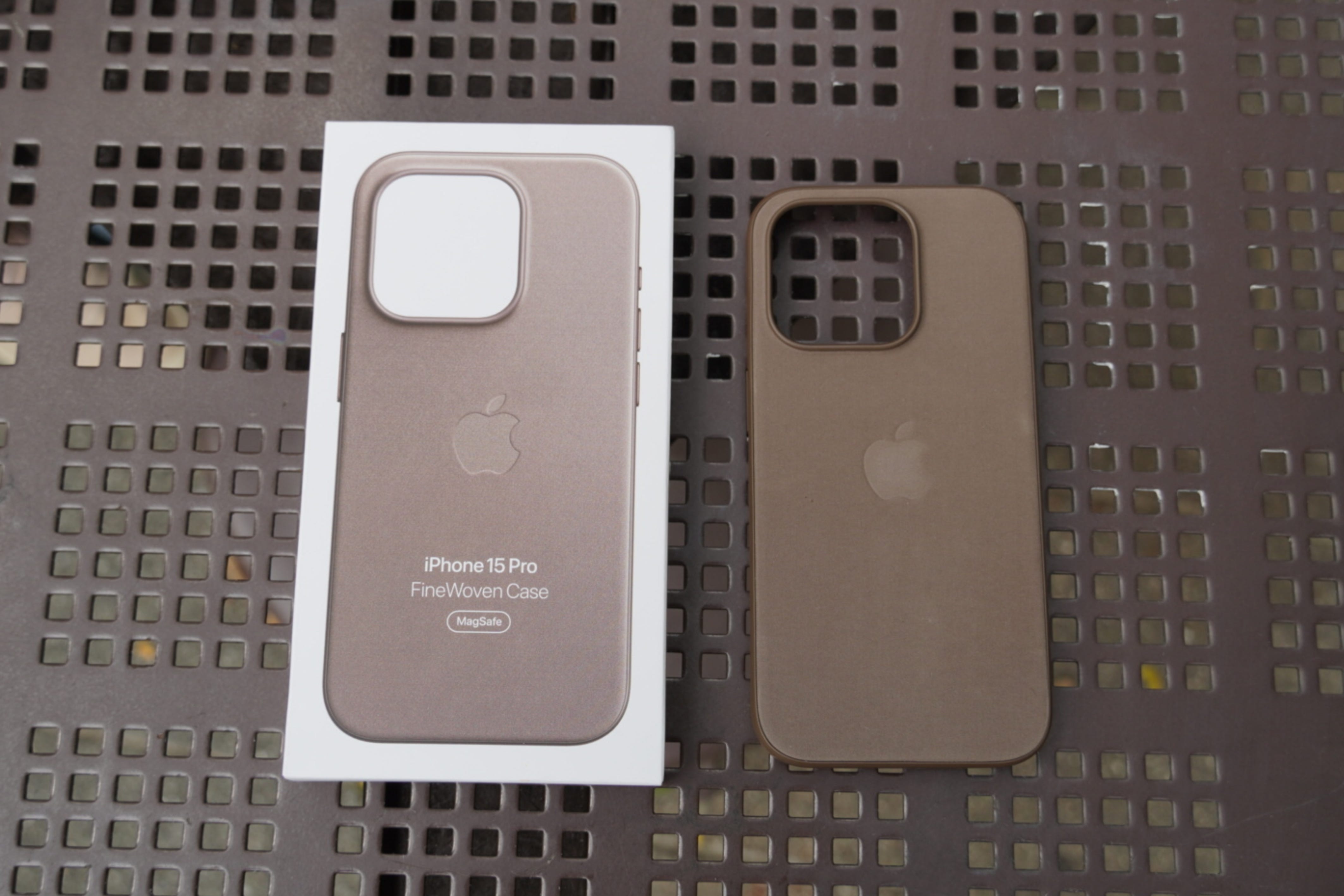
Surprisingly, Apple is selling FineWoven cases days before the official iPhone 15 release date. You can only get them at Apple Stores for now, and Apple employees at the flagship Fifth Avenue store in New York City said they wouldn’t officially be available until this Friday. Alas, I was able to snag one at a retail store in Queens, NY via online order pickup. I’ve spent about two days with the Apple FineWoven case for iPhone 15 Pro — though I can’t really use it, since I won’t be getting an iPhone 15 until release day.
Look and feel
A really nice texture, but a questionable appearance

Apple says that FineWoven has a suede-like feel, and I’ve seen others describe the material as denim-like. I’d say it feels most like felt, but however you classify it, FineWoven feels ultra-soft and satisfying. It makes a scratching sound when you rub your fingers across it that you’ll either find pleasing or extremely uncomfortable. YouTuber Aaron Zollo described it as like the sound of scratching a windbreaker or raincoat in his hands-on, and I completely agree.
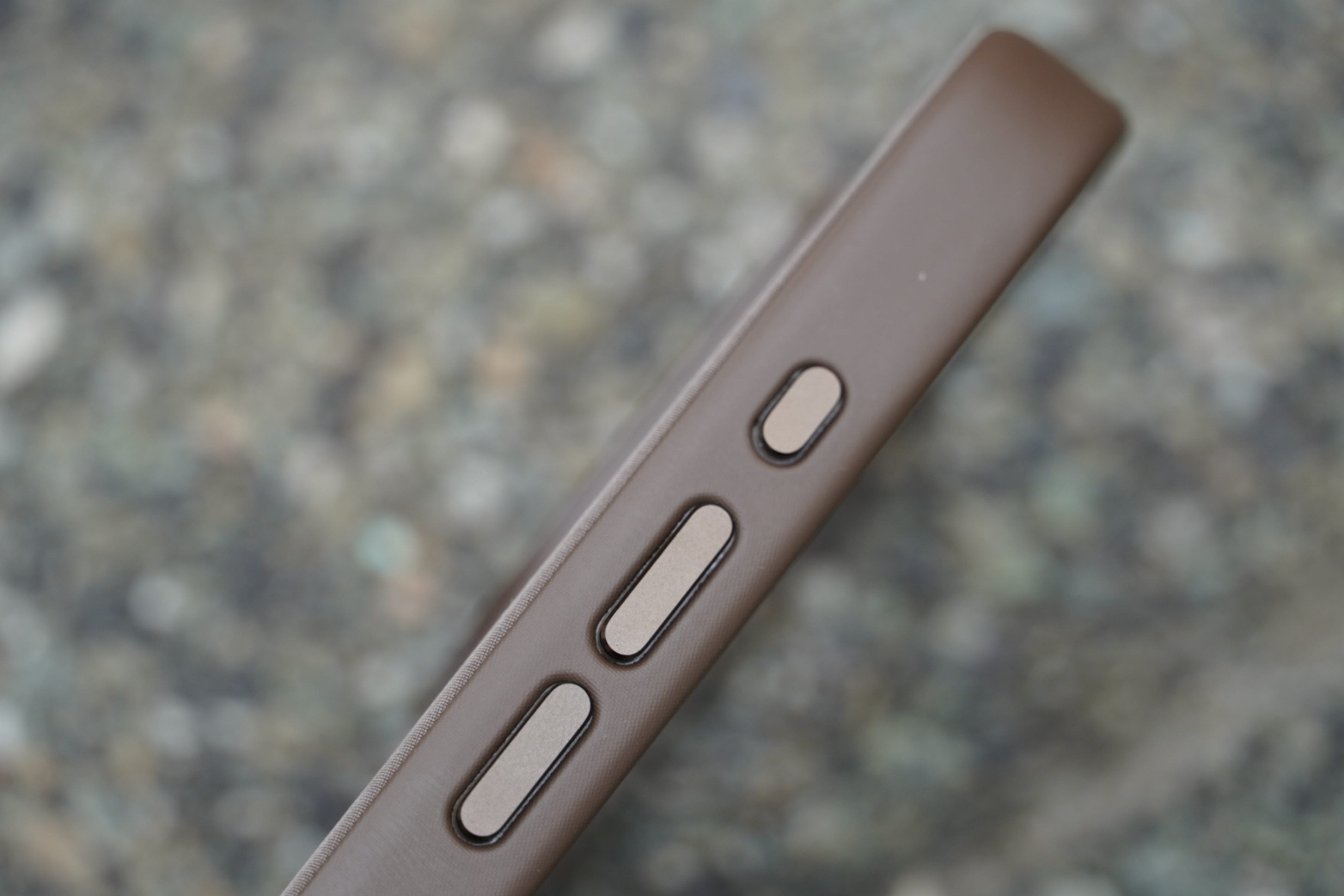
The sides of the case feel most like leather, and it’s made out of FineWoven material that’s even finer than the back of the case. It looks quite like leather, too, but you’ll easily see the FineWoven weaves while taking a closer look. This is the premium part of the case, with metal buttons that are colored to match the general hue of your FineWoven case. I chose the Taupe color, and it definitely looks darker than the stock images available on Apple’s online store. Your results might vary with other colors, though.
All of this doesn’t really matter to me, because there’s one key reason I can’t daily drive this case. The color of the FineWoven material isn’t consistent across the back of the case. Some spots will look darker than others, some will look lighter. I noticed this right after unboxing the case, so it wasn’t anything I got on the material. But I do think this is something that will get worse over time, as wear and tear further changes the consistency of the FineWoven case’s color.
Durability
Impossible to say at this stage, but I have my doubts

A lot of people are wondering whether Apple FineWoven will be durable over time, and that’s something I can’t possibly comment on now. However, I do have my doubts based on the overall build of the case. Even on the MagSafe ring — which includes the full alignment array, though the middle line is not accentuated — the back of the FineWoven material is extremely thin. There’s a lot of flex as a result, and it feels like I could snap the case in half with ease.
It’s important to note that an iPhone will give the case more structure, but FineWoven still feels flimsier than silicone or leather. I’ve seen Apple cases made of those materials deteriorate terribly over time, so it’ll be interesting to see how FineWoven fares.
Is FineWoven worth buying?
I’m really intrigued by FineWoven, and I want to like it. But right now, I have massive concerns about the material’s ability to replace leather and even silicone. The first Apple FineWoven case seems flimsy and doesn’t feature consistent color. I’ve never recommended a first-party Apple case, and that’s because third-party options are typically a better value. That isn’t changing, even with the debut of FineWoven.
Motorola Razr+ (2023) review: Fantastic software overcomes inferior hardware
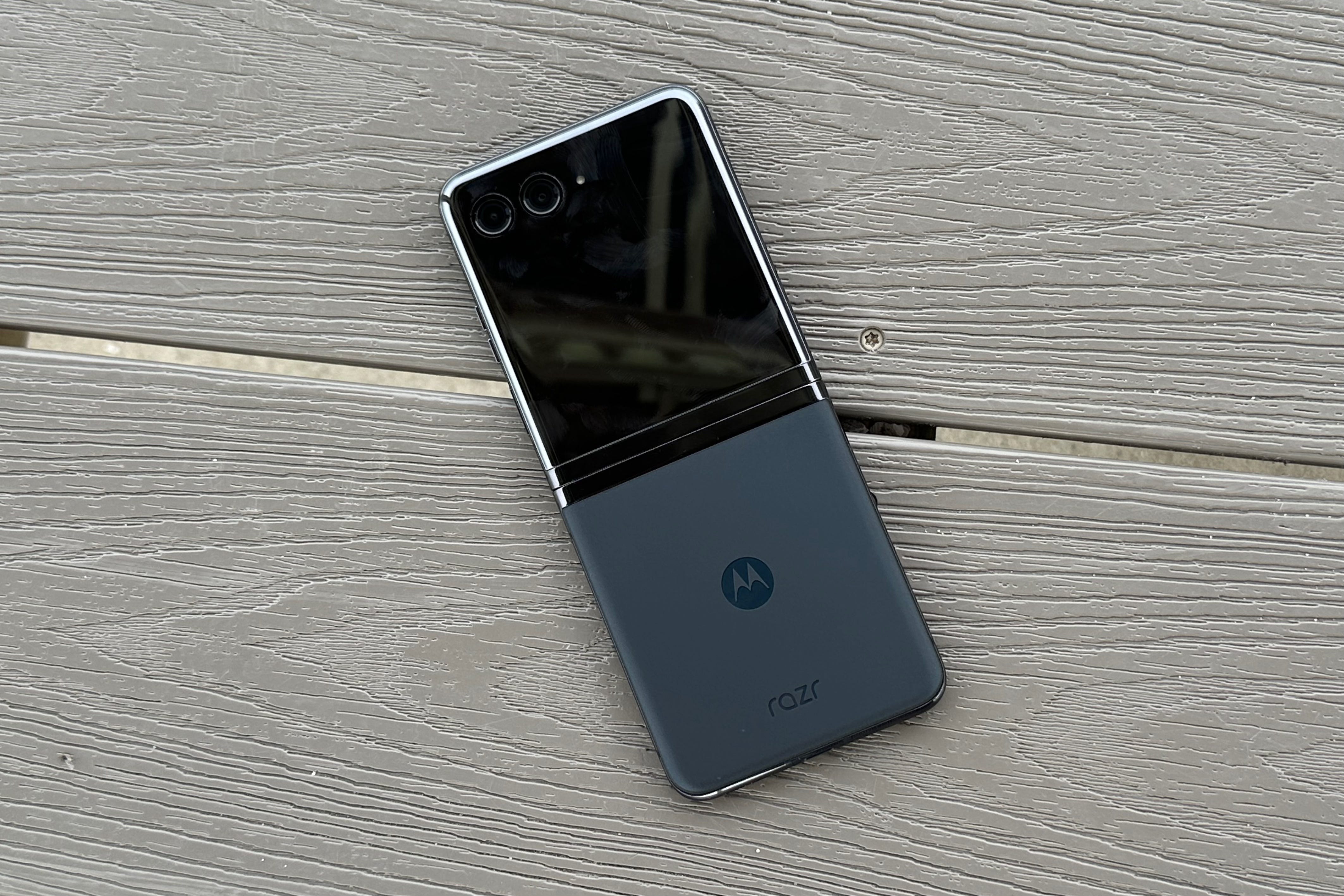
After years of being discontent with the tiny cover screens found on foldable phones, Motorola was the first to take the leap with a full-screen cover display. The company took a gap year and didn’t release a Razr flip phone in North America in 2022, but triumphantly returned with the Motorola Razr+ (2023). It ditches the iconic design of the older Razr smartphones in favor of a more modern and familiar one, adds a flagship processor, and features improved cameras.
But in the time since the Razr+ first debuted, Samsung unveiled its latest Galaxy Z Flip 5. Both phones are competing for the title of best clamshell foldable, and Samsung’s inclusion of a larger cover screen on the Z Flip 5 means that the Razr+ isn’t as unique as it once was. You might be inclined to choose the Z Flip 5 as your clamshell foldable because of the 5+ years Samsung has had to refine its hardware, and it’s true, Samsung’s hardware is better. If you really want an expansive and functional cover screen, though, Motorola’s software shines in the same areas where Samsung’s disappoints.
Design and build quality
Solid overall, but the hinge leaves much to be desired
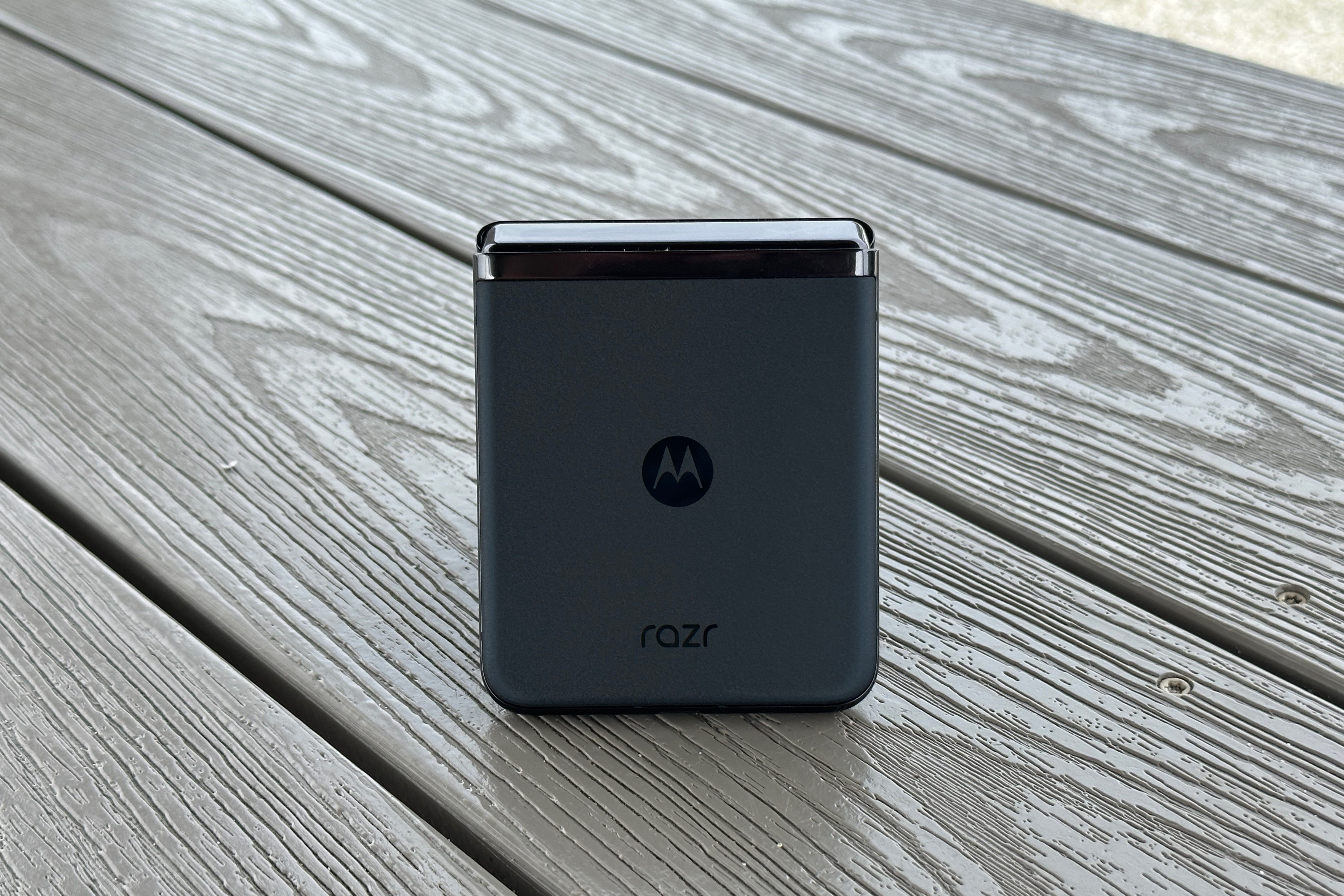
With modern clamshell foldables, there isn’t much to look at beyond screens. The 3.6-inch display found on the cover screen takes up the entire front of the phone when closed. On the inside, you’ll find a 6.9-inch panel, which covers the inside of the Razr+. The only surface you can spot on the Razr+ that isn’t the screen is the back of the phone, and this features a glossy Motorola logo and Razr wordmark. You can choose to get the Razr+ in Glacier Blue or Viva Magenta, but I chose Infinite Black because most of the phone is screen anyway.
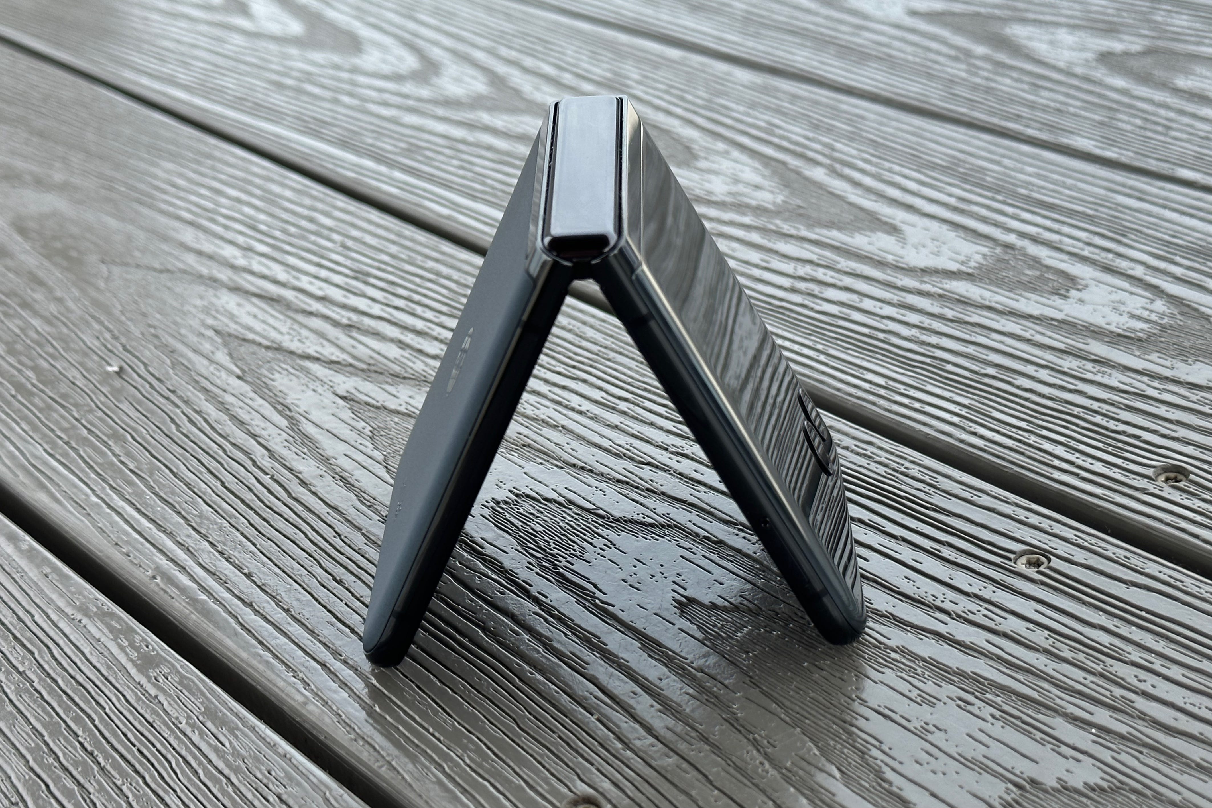
Motorola went with a curved design for the Razr+, which is different from the foldable we’ve seen from Samsung. Some might prefer this look, but I’ve found myself wishing that the Motorola Razr+ had a more boxy design. That’s because when closed, the curved edges of the phone come together and form an empty groove. If you’re used to carrying slab phones, this dead space will feel unnatural at first. Since part of this phone’s appeal is the usability of the cover screen, this design choice — whether you love it or hate it — will be a big deal.
Motorola seems to have produced a fairly-durable phone, but that remains to be seen in the long term. Though the Razr+ has an IP52 certification that leaves a bit to be desired in terms of water-resistance, it’s one of the few foldables to offer dust-resistance. That should keep dust and debris out of the hinge and screen assembly, which could prevent inadvertent damage. However, the ‘2’ in that IP rating means that anything more than light rain could cause the Razr+ to break.
The hinge is easily the worst part of this phone, and it’s something I’ve struggled to get over throughout my time using it. Samsung’s foldable hinges have a lot of resistance, and this means you can prop it up at any angle. Motorola’s hinge on the Razr+ has a lot of resistance too, but all the wrong kinds.
The Razr+ really only wants to be completely closed or completely open, and trying to set it at any other angle will cause the hinge to flop over. You can find a place at around 90-95 degrees where it’ll stay propped up, but this isn’t a great viewing angle for watching half-screen content. There’s no ‘flip factor’ here either — flipping the phone open with one hand is downright impossible.
I’ll share one key caveat here: the hinge’s shortcomings will be absolutely noticeable if you’ve used foldable phones before, but you probably won’t notice it if you’re used to the form factor.
Display
A cover screen you’ll actually want to use
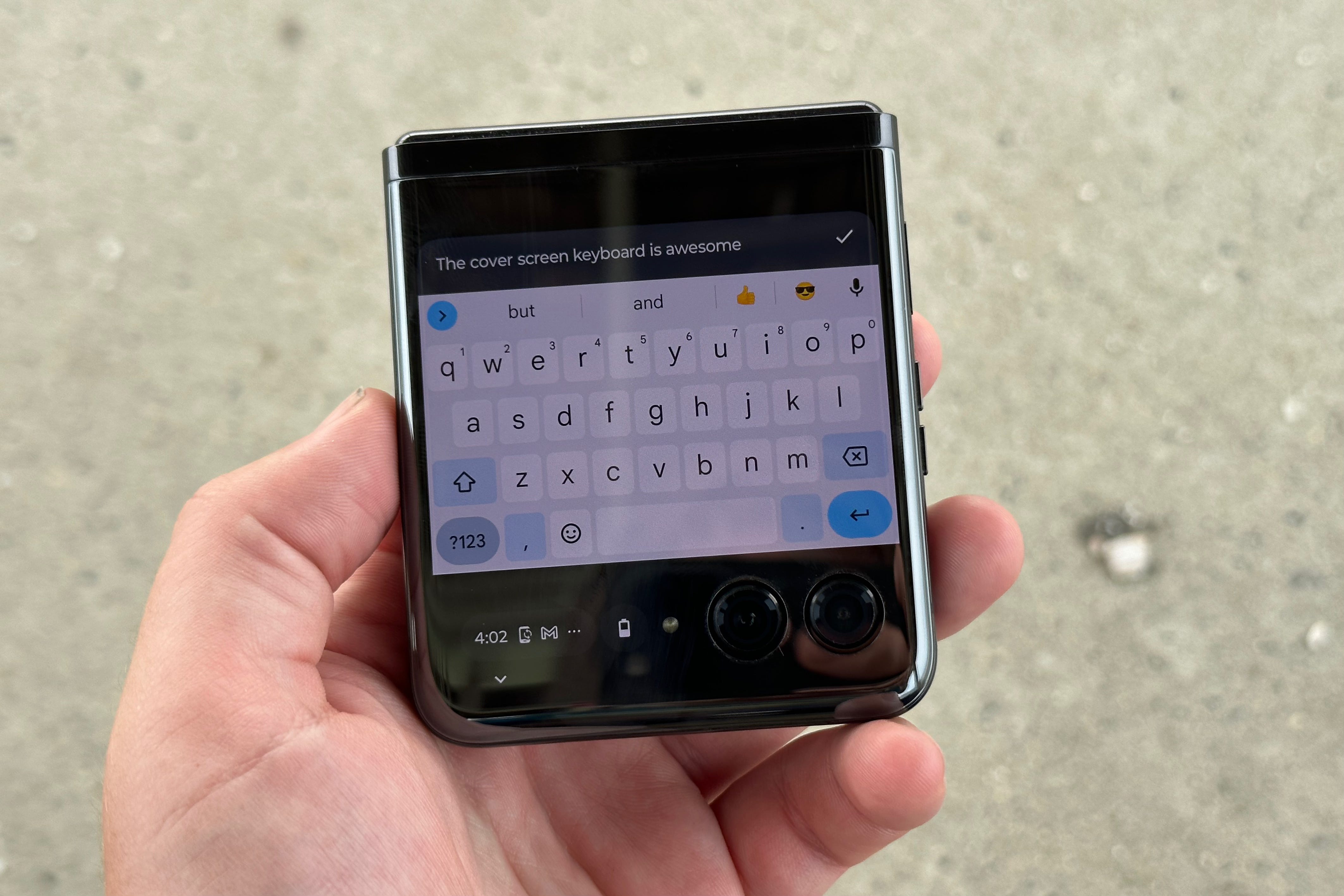
The reality of daily-driving a foldable phone is that you’ll use the cover screen a lot more than you think. That’s true even with my Galaxy Z Fold 4, which is why I’m so frustrated that Samsung refuses to widen the external display. However, to my surprise, the cover screen on the Motorola Razr+ might be the best I’ve used on any foldable phone — big or small. People have complained that big slab phones are unwieldy, and have championed for ‘mini’ smartphones. But they aren’t the solution, foldables are.
With great software — which we’ll get to in a minute — the Razr+ cover screen is the most comfortable way to use a smartphone. It’s the perfect size for use with either one hand or two, and the best comparison to the feel I can give is that it’s like using an old GameBoy or DS. The combination of size, weight, and feel gives you complete control over the device. And to my surprise again, the 3.6-inch OLED panel is big enough for nearly all tasks. Some apps, like Apple Music, are difficult to use not because of the screen size because of the app’s optimization for small screens. That is an issue you will run into from time to time.
When you get to the main screen, you’ll be impressed with the display quality in good lighting conditions. It’s a 6.9-inch AMOLED panel that supports refresh rates up to 165Hz. The operating system feels fluid and there are special modes for gaming, but I don’t think you’ll notice the difference between 120Hz and 165Hz daily. Since the Razr+ uses the clamshell form factor, it’ll be taller and thinner than most slab phones. However, the 22:9 aspect ratio is easy to get used to, and it’s perfect for watching videos picture-in-picture while doing other things on your phone.
Brightness leaves a little bit to be desired, but the Razr+ looks good on paper. It’s rated for 1400 nits peak brightness on the main display and 1100 nits on the inner display, which is passable in 2023. However, I’ve found that folding screens are harder to see across the board in direct sunlight, and the Motorola Razr+ supports this.
Just take a look at the image above and see how dim the Razr+ looks at max brightness on a sunny day.
Software and performance
Basically stock Android, and that’s the biggest compliment
The Motorola Razr+ runs My UX, which is Motorola’s custom Android skin, and an extremely light one at that. It definitely has Motorola’s design and style preferences in mind, but overall, it’s basically stock Android. That’s a good thing, because Google’s Android 13 is a clean and functional operating system that I think even bests Apple’s iOS at times. Plus, Motorola’s cuts and additions might even make it superior to stock Android, but that’s up for debate. For example, the “At A Glance” widget that is permanently fixed to Pixel home screens is replaced with an optional Motorola one that actually looks better — at least for my taste.
Software updates are questionable though, as Motorola has a history of abandoning ship after releasing certain smartphones. That is usually on the budget side of the company’s consumer cellular market, but it’s worth mentioning. With that said, Motorola guarantees three years of full OS updates and an additional year of security updates. That isn’t quite on par with Apple’s support, but is fair for Android devices in 2023.
As far as performance goes, the Razr+ finally has a flagship system-on-a-chip. It’s equipped with a Snapdragon 8+ Gen 1 Mobile Platform processor and 8GB of RAM, which should be more than enough for daily use. There wasn’t really a time where I could get the Razr+ to slow down, even in 112-degree heat. For what it’s worth, the Razr+ held up way better in extreme temperatures than my iPhone 14 Pro, which thermal throttled to become unusable. Running Geekbench 6, I recorded a 1,753 single-core score and a 3,057 multi-core score.
Motorola put a 3,800 mAh battery into the Razr+, which is smaller than we’d expect from slab phones but is about on-par with foldables. I was able to get a full day out of the Razr+ easily, and recharging was quick thanks to 30W fast charging support. However, wireless charging speeds are limited to 5W, which is a bit disappointing.
Cameras
Underpowered even when compared to other foldables
Cameras aren’t the reason you buy a foldable phone, and all smartphones that employ this form factor have meager camera systems. But the one in the Razr+ is especially bad, even when compared to the Galaxy Z Flip 5. The main camera is a 12MP f/1.5 sensor with optical image stabilization, and it’s paired with a 13MP f/2.2 macro sensor. There’s also a 32MP hole-punch, front-facing camera in the main screen. But, since this is a foldable, you should use the rear camera system for selfies whenever possible.
In solid lighting conditions and at reasonable distances, the Razr+ takes good shots. The trouble comes when you get considerable distance between you and your subjects, or when it starts to get dark out. There’s no telephoto lens here, which means you don’t get any level of optical zoom. If you’re used to optical zoom on your smartphones, the absence of it here will make you completely rework the way you take photos.
Here are some photo samples taken with the Motorola Razr+:
Should you buy the Motorola Razr+ (2023)?
It’s no secret that if you’re looking to buy a clamshell foldable in the U.S., you’re choosing between the Samsung Galaxy Z Flip 5 and the Motorola Razr+ (2023). While the former probably has better hardware in a few key areas, Motorola lets you take full advantage of the specs it does have. You can do just about everything on the cover screen, and I don’t just mean running apps. System-wide functions, like the control center, are at full strength on the cover screen.
If you’re intrigued by the new form factor for clamshell foldables, marked by a useful cover screen, you’ll be more satisfied by the Motorola Razr+. I love using it, and I think it represents the future of “mini” phones.
Apple made the right choice keeping Beats around, and the Studio Buds Plus prove it
Apple is moving to a subscription-based revenue model, and it’s easy to see why. When the iPhone 14 is basically the same as the iPhone 13, which is a slight improvement over the iPhone 12, the average person doesn’t need to upgrade every single year. But with a subscription model, Apple’s customers can pay a lump sum for new products every couple of years while also paying monthly subscription fees.
That’s part of the reason Apple bought Beats Music and Beats Electronics back in 2014, which was popularized by star athletes and celebrities, including co-founder and legendary producer Dr. Dre. Beats had a growing streaming service at the time called Beats Music, and that platform became the groundwork for Apple Music as we know it today.
Two years later, Apple would announce the first AirPods, which would eventually become one of the most popular earbuds in the world. Beats releases and news slowed during this time, and a lot of people — myself included — thought the brand was dead.
That started to change, and the 2019 Powerbeats Pro all but cemented the stability of Beats in the Apple era. The Powerbeats Pro release featured an Apple-branded chip and the brand’s first truly-wireless headphones, and it sent a message that Beats were here to stay.
In the four years since that momentous product launch, Beats has released the Solo Pro, Powerbeats, Beats Fit Pro, Beats Studio Buds, and most recently the Beats Studio Buds Plus. In a market dominated by Apple’s own AirPods lineup, it’s somewhat surprising that Beats have stuck around, and that’s certainly a good thing.
Beats sent over its latest Studio Buds Plus for review, and they’re perfect example of why Apple made the right decision by letting the Beats brand live on. Beats has a level of character that Apple doesn’t, one that is partially backed by strong celebrity partnerships but is also related to its tangible products. While Apple might release a new color iPhone during springtime, Beats creates unique designs that are the result of creative partnerships — and now has a transparent colorway.
The transparent Beats Studio Buds Plus simply look cool, and although Nothing did it first with Ear (1) and (2), I think Beats does it better. In a tech sector that often features products that all look relatively the same, it’s great that Apple is using Beats to provide another option from the (stale) glossy-white AirPods.
It’s more than just looks
The design and character of the Beats brand is certainly part of their products’ appeal, but they also pack the feature set to boot. Beats are the best earbuds and headphones for people who want the flexibility to switch between the iOS and Android ecosystems.
In fact, Beats are the only headphones to feature fast pair on both platforms. Considering that you need a handful of third-party apps to make AirPods work well on Android, they aren’t a convenient solution for people that are not fully invested in the Apple ecosystem. Beats, however, get pretty close to complete feature parity on both platforms.
When AirPods became one of the most popular earbuds in just a few years, it looked like Beats as we knew it was doomed. As it turned out, that premise was true. Beats as we knew them are dead. Now, they’re the most well-rounded earbuds on the market that somehow retain the same character that made them a pop-culture hit in the first place.
Pixel 7a first impressions: Google's latest flagship killer is here
Google’s highly-anticipated Pixel 7a debuted at Google I/O 2023, an annual developer conference that also brings a few product releases along for the ride. I’ve been using a Pixel 7a, provided by Google for review, for about a day. In a sentence: I prefer the Pixel 7a over my Galaxy Z Fold 4 so far, and that says a lot about Google’s ability to optimize hardware and software.
Physically, the Pixel 7a is one of the most comfortable smartphones I’ve ever held. Something about slight curved edges and the glossy plastic back feel great in the hand, and I said something similar about the Pixel 7 Pro in my review of that smartphone. Since the Pixel 7a has a smaller form factor, it feels even better. The 6.1-inch display is on the smaller end in 2023, but I think it’s a comfortable size for most people.
The display does lag behind in other areas, though, with a 90Hz OLED panel and a peak brightness of 1,200 nits. It has been difficult to view in direct sunlight in some situations so far, but I wouldnt say it’s a dealbreaker just yet. Since last year’s Pixel 6a was limited to just a 60 Hz refresh rate, the Pixel 7a is an improvement that brings the device even closer to the Pixel 7.
Google has found a happy medium with regard to the color options available on the Pixel 7a, too. There are Obsidian and Snow colors that are essentially black and white for those who prefer basic tones. For people who like to make a statement with their phones, the Sea and Coral colors are flashy. Sea is a light blue color, and Coral is a bright mix between pink and orange. Though Sea is definitely more pastel than bright in person, it’s easily my favorite color out of all the Pixel 7 series options.
Despite the Pixel 7a being $300 less than Google’s flagship Pixel 7 Pro, it feels just as snappy. That’s because it has the same Tensor G2 system-on-a-chip as that high-end smartphone. This is the Pixel 7a’s calling card: performance that can rival flagships with a mid-range price tag. Due to Google’s impressive app optimization with stock Android, I’ve already noticed the Pixel 7a runs Google apps — like Chrome — better than my Galaxy Z Fold 4.
The Pixel 7a makes the Pixel 7 redundant, and is clearly the leader of the pack in the mid-range category. At $499, anyone willing to give the Pixel brand a shot should take a look at the A-series line first.
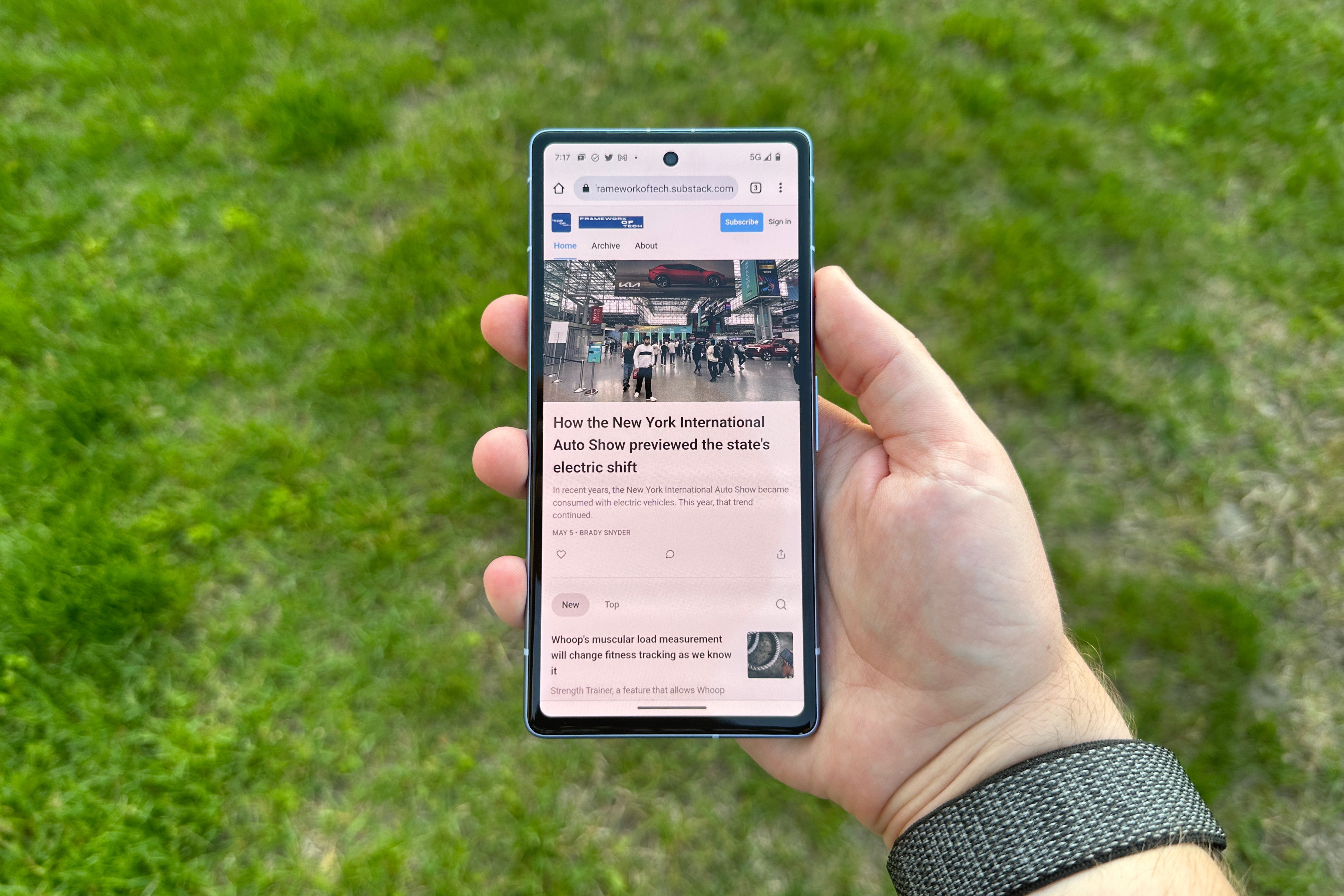
Stay tuned to Framework of Tech for a full review of the Pixel 7a.
How the New York International Auto Show previewed the state's electric shift
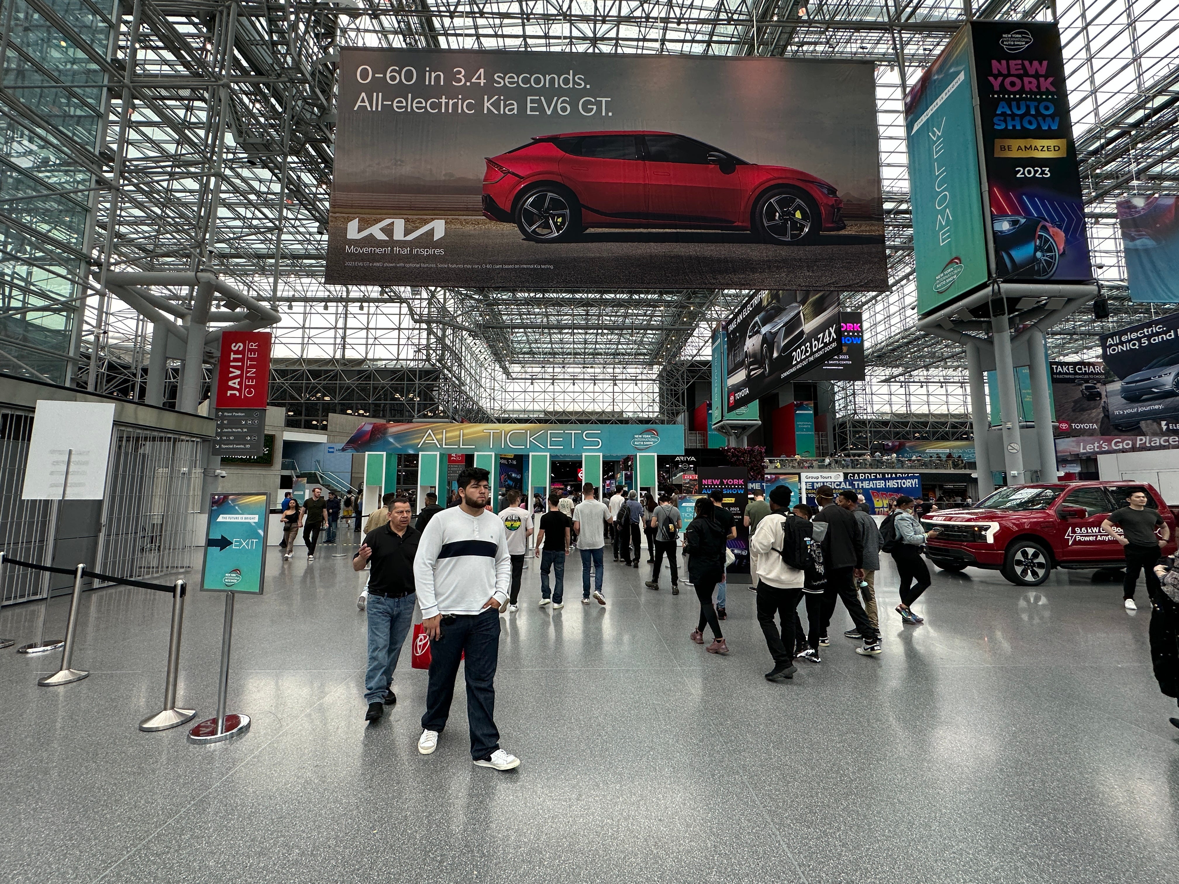
The 2023 New York International Auto Show cruised into the Javits Center in Hells Kitchen from April 7 to April 16, but with a twist. The push to move from typical combustion-engine cars to electric-powered vehicles has been ongoing for years, however, it has only recently become a serious consideration in the mainstream car industry.
In fact, the 2023 Auto Show was one of the first events to be dominated by electric cars. That’s because in 2020 and 2021, the annual Auto Show was cancelled due to the COVID-19 pandemic. Last year, though the event did make an in-person return, attendance was limited and attendees needed to be vaccinated for COVID-19 to enter.
It’s only fitting that the emergence of electric vehicles is taking place in New York City, where legislators and other elected officials are trying to build electric vehicle infrastructure through a program called Evolve NY. The New York Power Authority, a New York State public-benefit corporation, first announced the Evolve NY program in 2013, with support from then-governor Andrew Cuomo coming in 2018.
The heart of the plan involves investing $250 million into installing 800 new electric vehicle fast charging stations across New York by 2025. It is part of a larger effort to reduce greenhouse gas emissions by 40 percent by 2030, according to the 2018 statement by the governor’s office.
The Evolve NY exhibit at the NY Auto Show
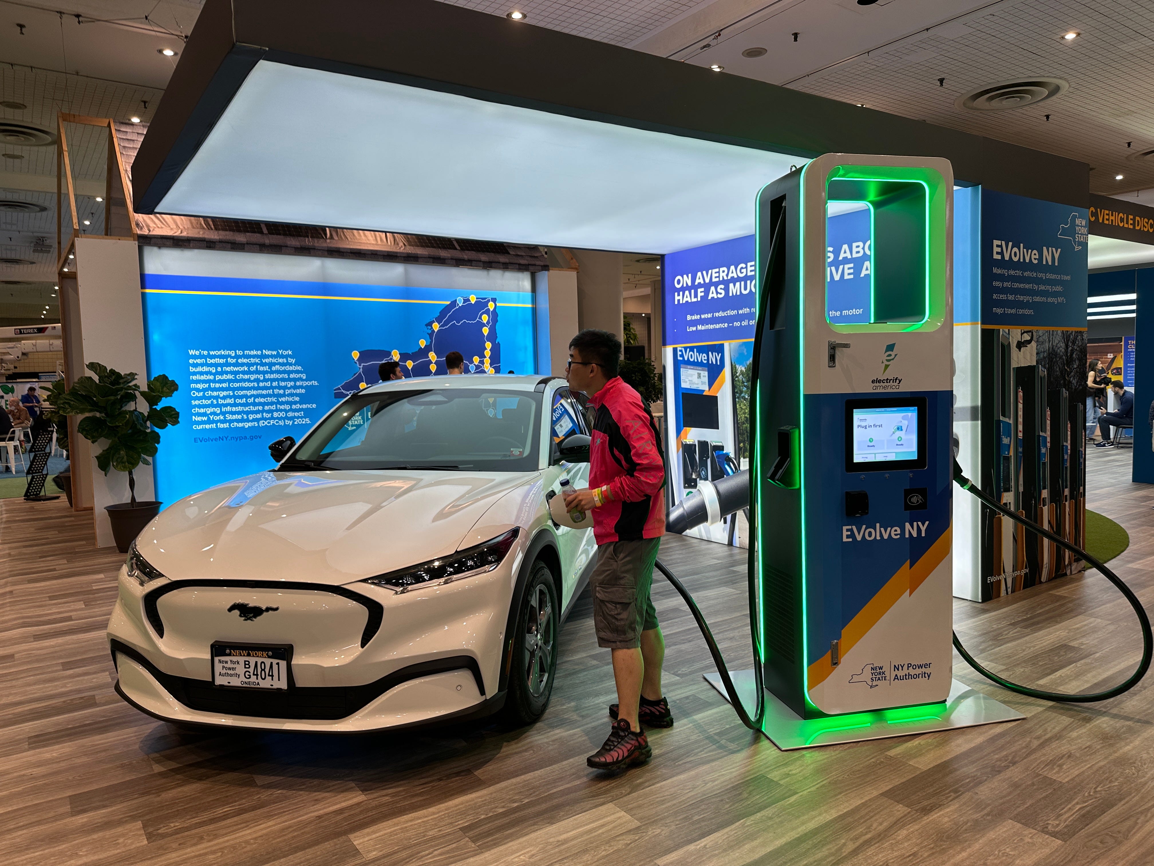
The Evolve NY program was front-and-center at the Auto Show, with an interactive exhibit allowing visitors to try out a New York Power Authority charger for themselves. By installing these chargers along key routes in the state, the government hopes to make longer trips possible with electric vehicles.
“They’re trying to build chargers where people need them to cross the state,” a representative at the Evolve NY exhibit said. “This event is helping people learn about charging, how to live with an electric vehicle, and for those that are interested in buying them, we can show them the incentives available.”
Those incentives are backed by the state’s Charge NY initiative, which offers a Drive Clean Rebate of up to $2,000 for the purchase of new electric cars. There are also an assortment of state and federal tax credits that reward electric vehicle ownership. According to Atlas Public Policy, the state has paid out $104.9 million over 92,515 rebates since the program was enacted in 2017.
The infrastructure issue is a crucial part of assimilating electric vehicles into the state’s fleet, because driving an electric vehicle is complicated by its range and charging. A report by the U.S. Department of Energy in 2022 revealed that the median range of an electric vehicle was 234 miles, which is significantly less than the 403 miles provided by gasoline-powered vehicles. The same report said the maximum electric vehicle range was 405 miles, which is still dwarfed by the 765-mile maximum of gas-powered vehicles.
That report was based on the 2021 year of electric vehicles, and there’s been a shift in the right direction in the time since. The average range for an electric vehicle in 2023 was 291 miles, Bloomberg reported in March. Though range is improving, it still does not compare to that of combustion-engine cars.
“One of the major reasons cited by drivers for not buying an electric vehicle is a fear of running out of charge on the road,” said Lynne Smith, a spokesperson for the New York Power Authority. “Hosting a booth at the nation’s largest auto show allows New York State to reach an audience with a specific interest in the latest models and new technology and show why it makes sense to purchase and drive an electric vehicle.”
The Evolve NY charging stations are part of the Electrify America network, which is the largest public electric vehicle fast charging network in the U.S. At Electrify America and Evolve NY chargers, electric vehicle owners of all makes and models can charge their car in as little as 20 minutes.
“Drivers who are confident they will be able to find fast, convenient charging stations away from home are more likely to purchase EVs,” Smith said.
Where does Evolve NY currently stand?

Five years into the seven-year Evolve NY program, the exhibit at the 2023 New York International Auto Show represents a turning point in the shift to electric vehicles in New York State. There are already more than 8,000 Level 2 chargers — which charge vehicles faster than standard wall chargers — installed across the state, Smith said.
However, the real goal lies with DC fast charging, which can charge electric vehicles in between 15 minutes and 45 minutes. That is a significant jump from at-home Level 1 charging, where it can take hours or days to fully charge an electric vehicle, depending on the size of its battery.
Smith said the New York Power Authority plans to add 400 more DC fast chargers, also known as Level 3 chargers, across the state through the Evolve NY program. That would add to the state’s current total of 1,218 DC fast chargers, a figure that includes 409 Electrify America and Evolve NY charging stations.
The Evolve NY and Charge NY programs are making an impact on the streets, where there are more than 139,000 electric vehicles registered in the state. New York is still on track to meet its goal of having 850,000 zero-emission vehicles by 2025, but it has a long way to go before meeting that goal.
However, if the showing at the New York International Auto Show was any indication, there is promise. All the largest U.S. automakers — from Ford to General Motors — showcased new electric vehicle models at the trade show, and the infrastructure built through Evovle NY could make owning an electric vehicle more accessible and familiar to drivers.
iPhone 14 Pro Review: Six Months Later
Apple often makes a noticeable, visual change between every iPhone generation.
If nothing else, buyers and onlookers can distinguish different iPhone model years by their physical appearance. It gives each iPhone the feeling of being new, even if it is largely unchanged from the previous model. This year, Apple did just that with the Dynamic Island on the iPhone 14 Pro.
It’s a user-interface change that naturally incorporates the front-facing camera cutout into the operating system rather than ignores its existence.
The Dynamic Island was added to the iPhone with the release of the iPhone 14 Pro and iPhone 14 Pro Max. While the iPhone 14 and 14 Plus look virtually identical to their predecessors, the iPhone 14 Pro series switches up the iPhone's display for the first time since 2018.
Apple also reduced the size of the Face ID sensors in the iPhone, allowing them to shrink the notch into a pill. But part of the reason Dynamic Island works is because the pill-shaped cutout on the iPhone 14 Pro isn't a pill.
Instead, the hardware comprises a smaller pill-shaped cutout and a hole punch cutout, forming a horizontal 'i' in the display. Each pixel can be turned off individually with OLED displays, resulting in deeper blacks. As a result, Apple can shut off the display area between the two cutouts to create a uniform look — and provide added functionality in the space between.
The Dynamic Island takes up more space on the iPhone's display than the outgoing notch.
That means that although Dynamic Island is more engaging to the user than the notch found on most recent iPhones, it will obstruct more of the user's content.
Apple has made the iPhone 14 Pro taller in an attempt to compensate for the intrusiveness of the Dynamic Island. The iPhone 14 Pro comes in at 5.81-inches in height, compared to 5.78-inches on the iPhone 13 Pro.
Beyond the Dynamic Island, the iPhone 14 Pro’s display is twice as bright as its predecessor and has always-on capabilities. Its 2,000-nit peak brightness rating makes it the brightest smartphone ever, and the device’s ProMotion display can refresh as slow as once per second.
That allows the iPhone to keep the lock screen always on without hindering battery life.
iPhone 14 Pro offers the first major update to the iPhone's main camera sensor in years, but that comes at a cost — a large and cumbersome camera bump.
It has a 48-megapixel main shooter paired with ultra-wide and telephoto secondary sensors. That provides crisp photos and up to 2x optical zoom. You can get closer by using digital zoom, which is clear between 3x-5x. Any more than that and photos will look blurry or grainy.
Apple lists the depth of both the iPhone 14 Pro and the iPhone 14 Pro Max at 0.31 inch, or 7.85 millimeters. For perspective, the iPhone 14 Pro is as thick as a stack of seven quarters. That's pretty thin, but this year's flagship iPhones are slightly thicker than last generation's iPhone 13 Pro and iPhone 13 Pro Max.
The reason for the increase in thickness isn't a bigger chassis or a larger battery. Instead, it's a larger camera system. Apple has pushed the limits with the iPhone's camera bump for years, and its new iPhone 14 Pro camera system is the thickest to date. It also takes up more space on the back of an iPhone — the iPhone 14 Pro's camera bump is a 1.5-inch square.
Apple doesn't provide information on the size of the camera bump specifically, but it looks to be about the thickness of two quarters. The significant disparity between the camera bump and the main chassis leaves the iPhone unbalanced and wobbly when placed flat on a surface.
Due to the lenses protruding from the main body of the smartphone, there is an increased risk of damage to the camera system. The three lenses are likely to be the first point of impact when the phone is dropped on its back, which could lead to cracking.
Apple doesn't offer a lot of details about the iPhone 14 Pro's battery life.
The company says it can complete 23 hours of video playback and 75 hours of audio playback on a single charge, but neither of those figures represent daily use. It has a capacity of 3,200 mAh, which is slightly more than last year's iPhone 13 Pro.
In real-world testing, the iPhone 14 Pro averaged about six-and-a-half hours of screen-on time over a 10-day period. Screen-on time is a metric as simple as it sounds, and quantifies how long a phone has actually been used. This includes browsing social media or the web, watching videos or sending messages.
Power-users will find that they need to charge their battery around midday to keep the phone alive, but the average user will likely be satisfied with the iPhone 14 Pro's battery life.

Performance is improved as well, thanks to the inclusion of Apple's A16 Bionic chip. It has a six-core CPU and a five-core GPU, the latter of which Apple says has 50% more memory bandwidth. In simple terms: the iPhone 14 Pro has all the power needed to be as smooth and speedy as any smartphone on the market.

Whether or not the Dynamic Island is a gimmick or game-changer, the iPhone 14 Pro makes a compelling argument that it's time to upgrade. It has a better display and camera, provides faster performance and has a slightly longer battery life. But it's only worth the jump for some users.
People who are still using an iPhone X or XS (released in 2017 and 2018, respectively) will certainly feel the difference between their current devices and the new 14 Pro. iPhone 11 and 12-series owners will still feel the changes, but on a lesser scale. In most ways, iPhone 13 Pro users won't find much of a difference between their current device and the new 14 Pro.
Starting at $999, the iPhone 14 Pro comes at a hefty price tag, but people still carrying older devices can appreciate the additions to Apple's latest "Pro" smartphone.